Initial Sketches
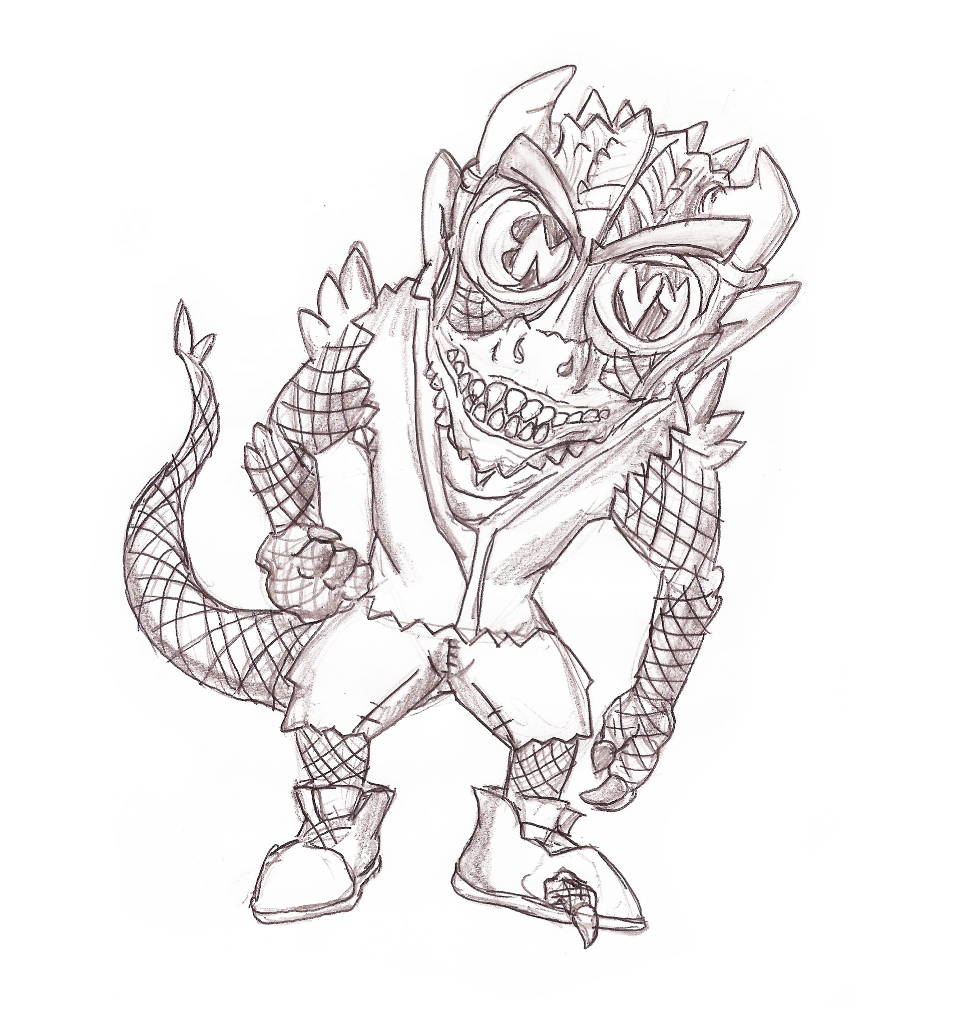
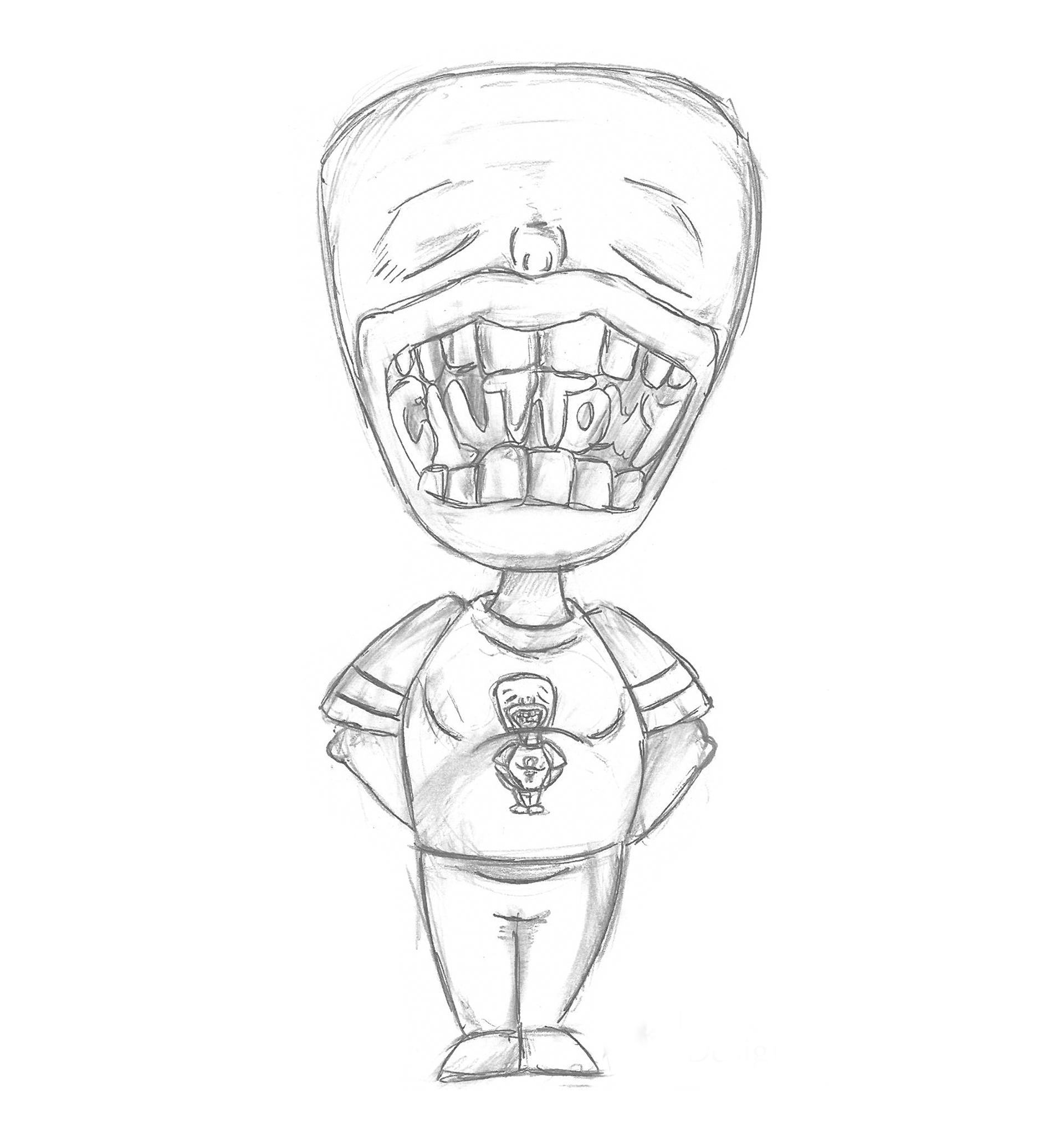
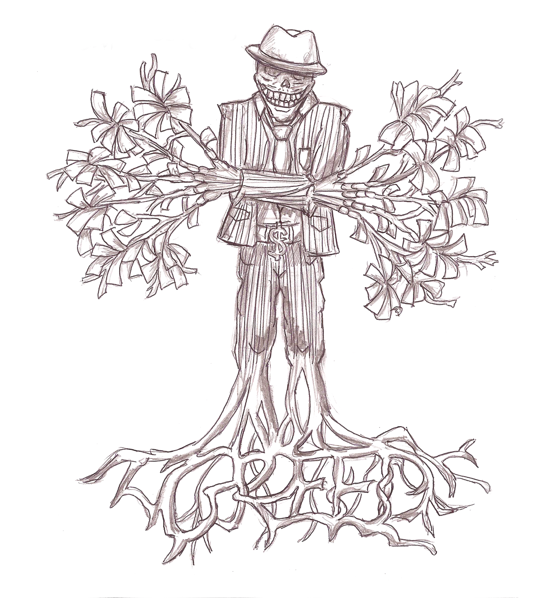
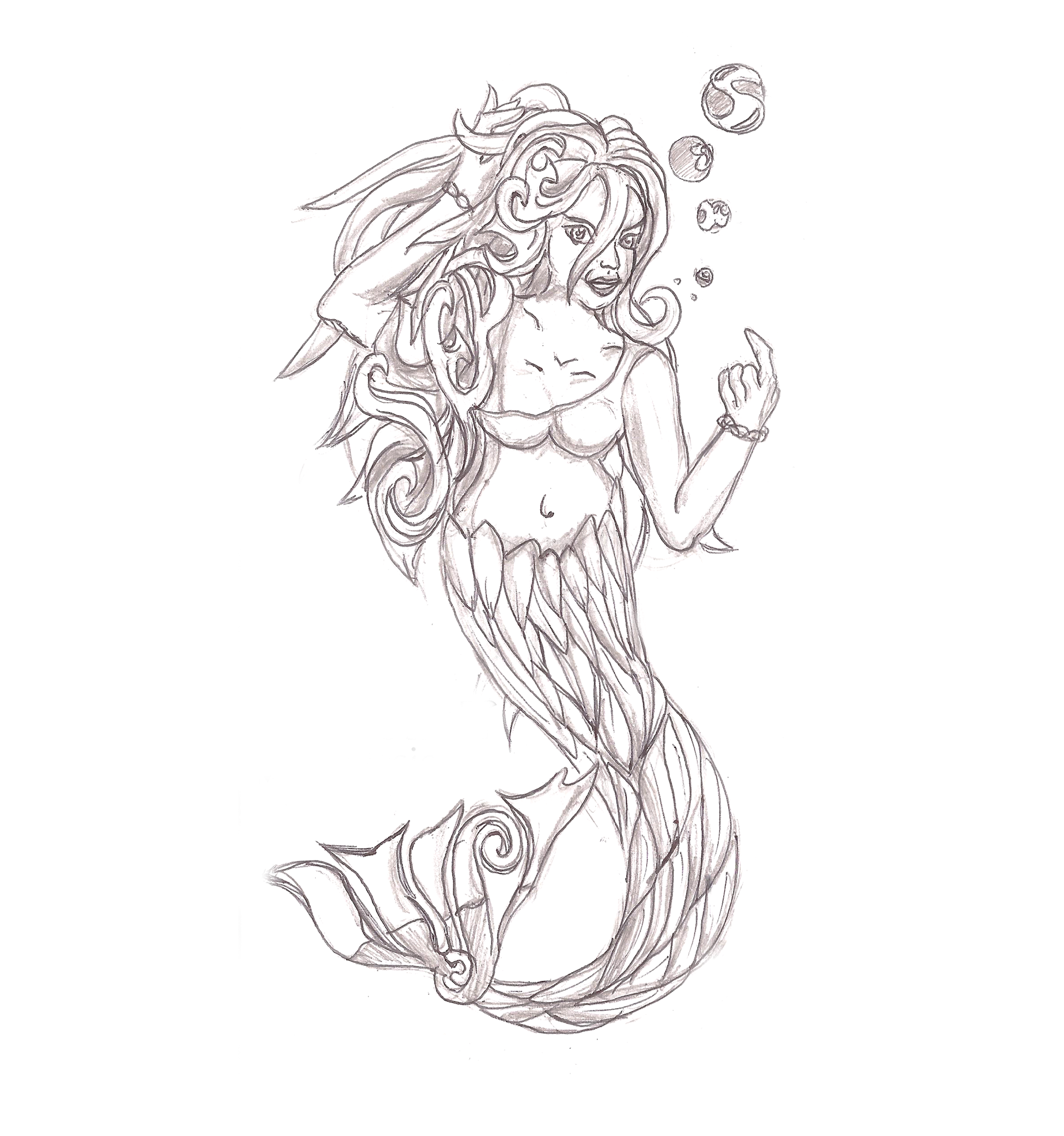
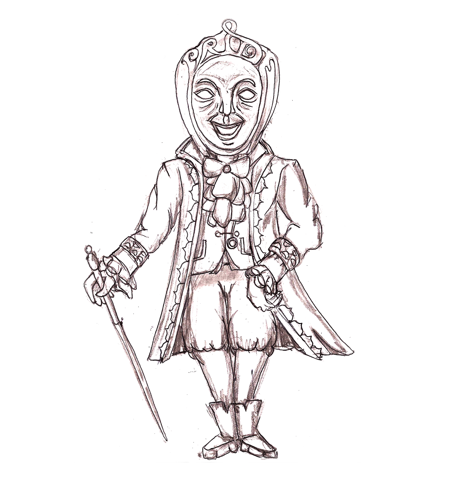
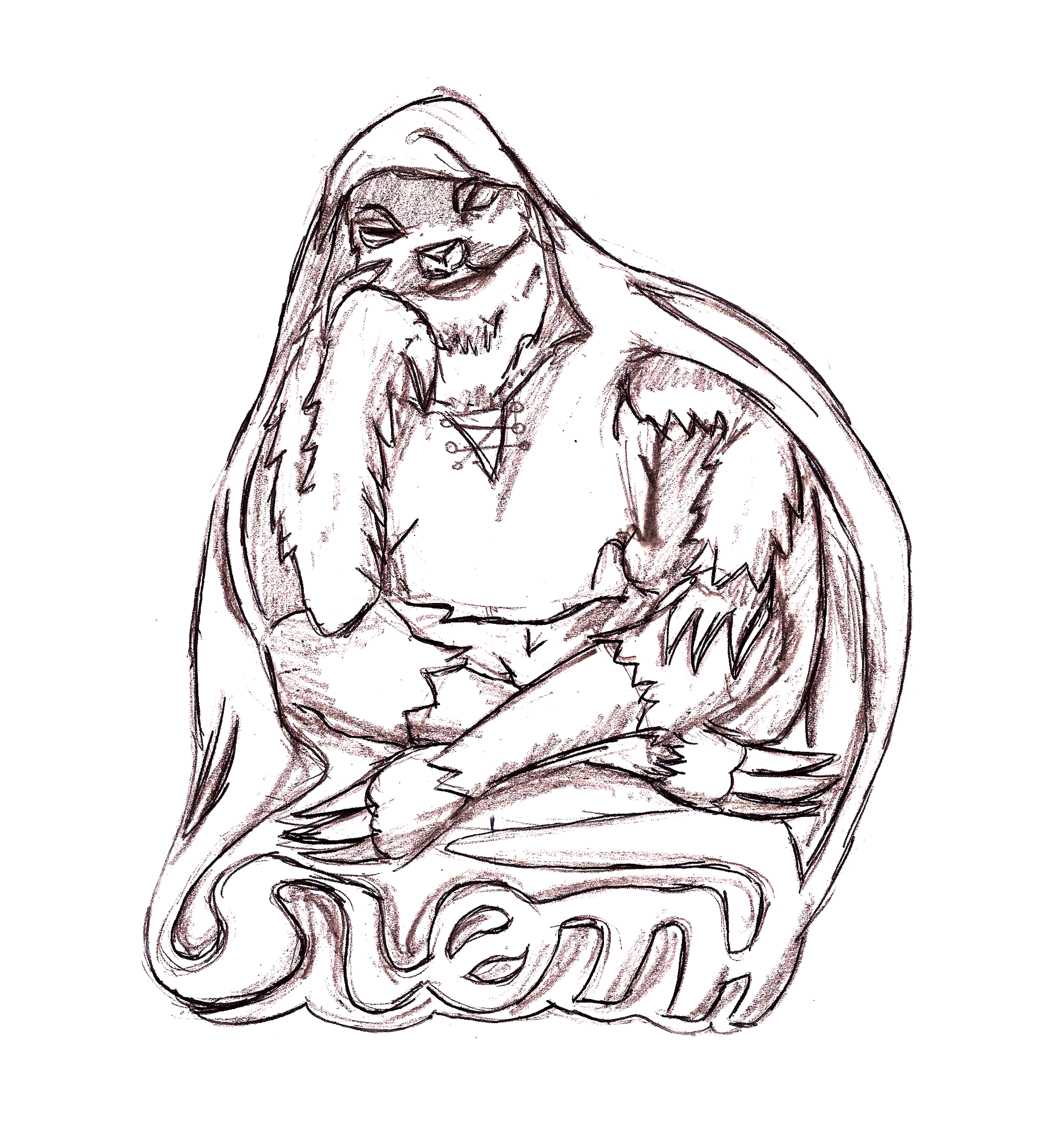
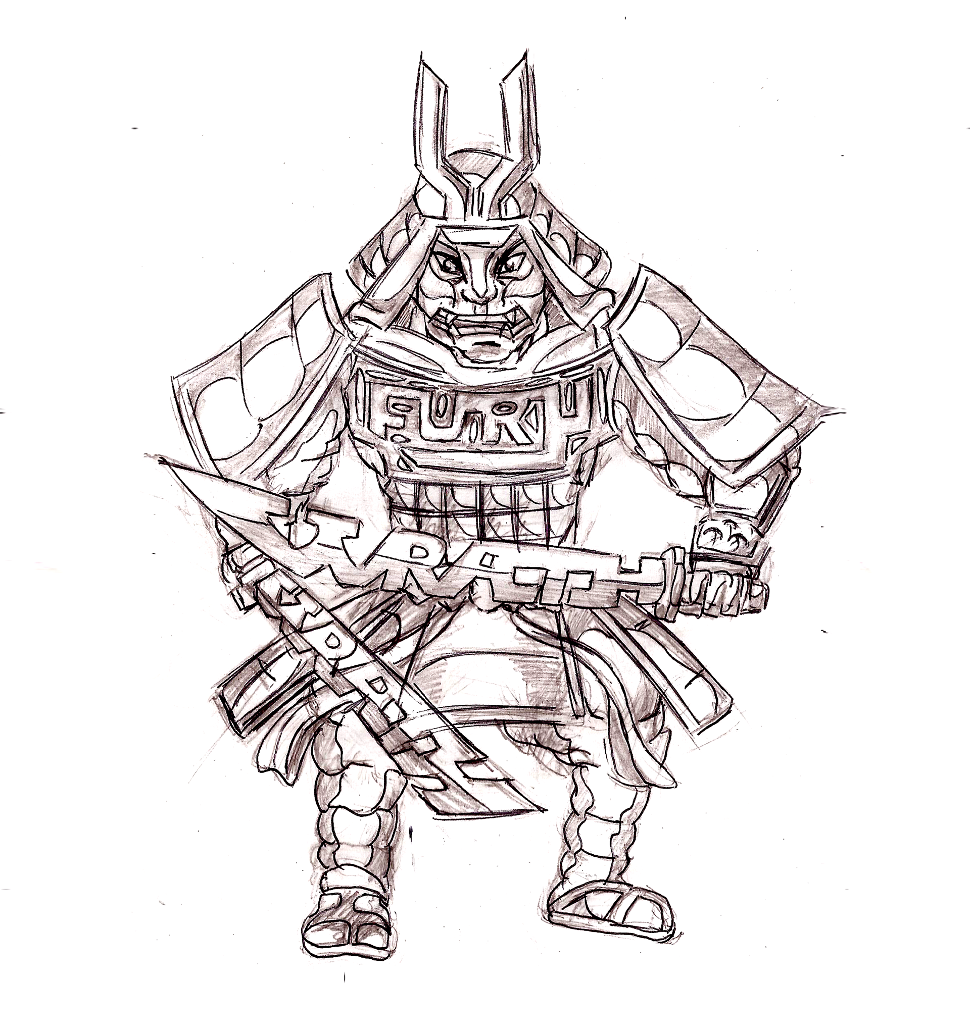
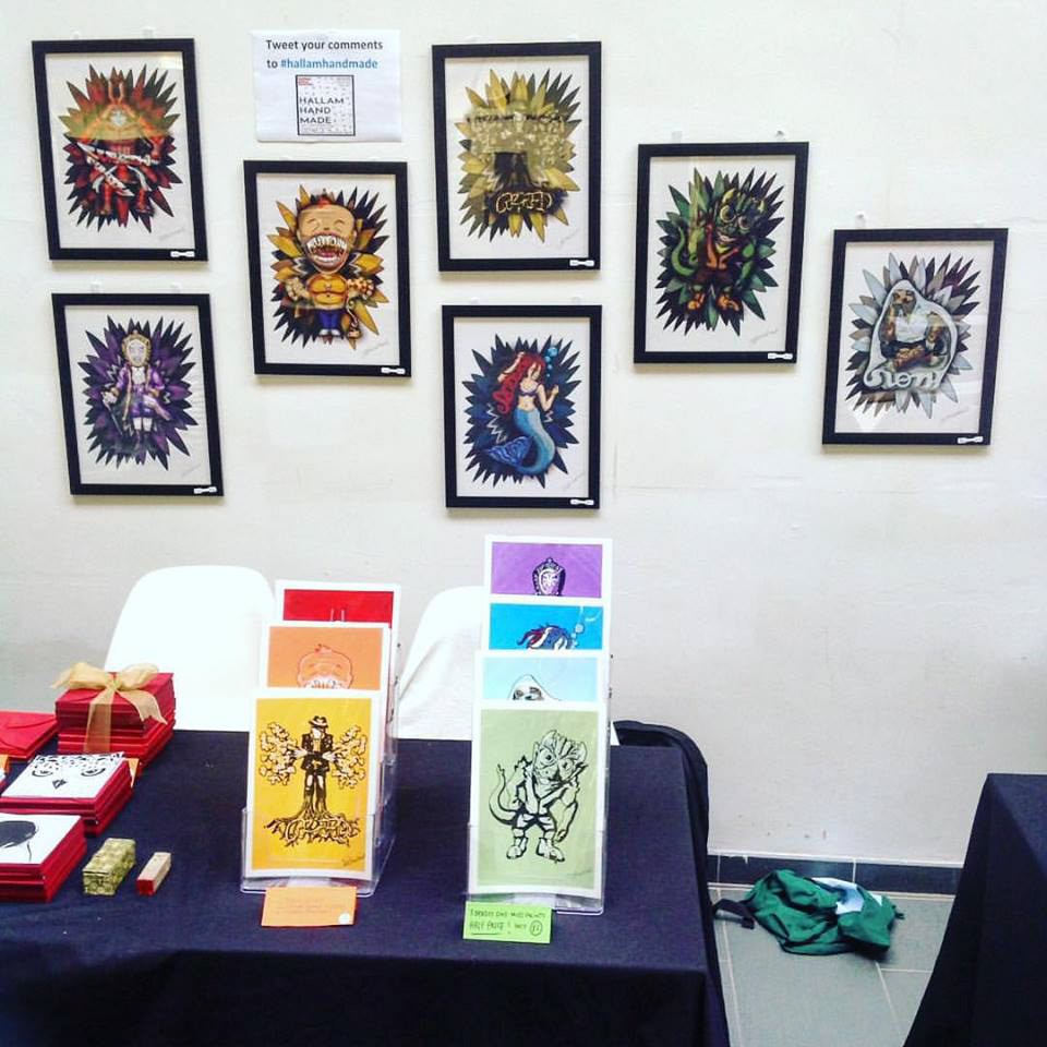
This was a fun and slightly challenging project both conceptually and stylistically, as this was a personal project I had free rein over the goal and flow of the project creating fun cartoonish takes on the 7 deadly sins by incorporating typography of the name of the sin into each of the illustrations themselves. That being Envy depicted as a Lizardman, Gluttony an out-of-proportion Human, Greed a skeleton Banker, Lust a Siren, Pride a 1700's French Aristocrat, Sloth a Sloth, and Wrath is a 12th Century Samurai.
Development in Adobe Illustrator
Original Design
Remastered Design
Envy
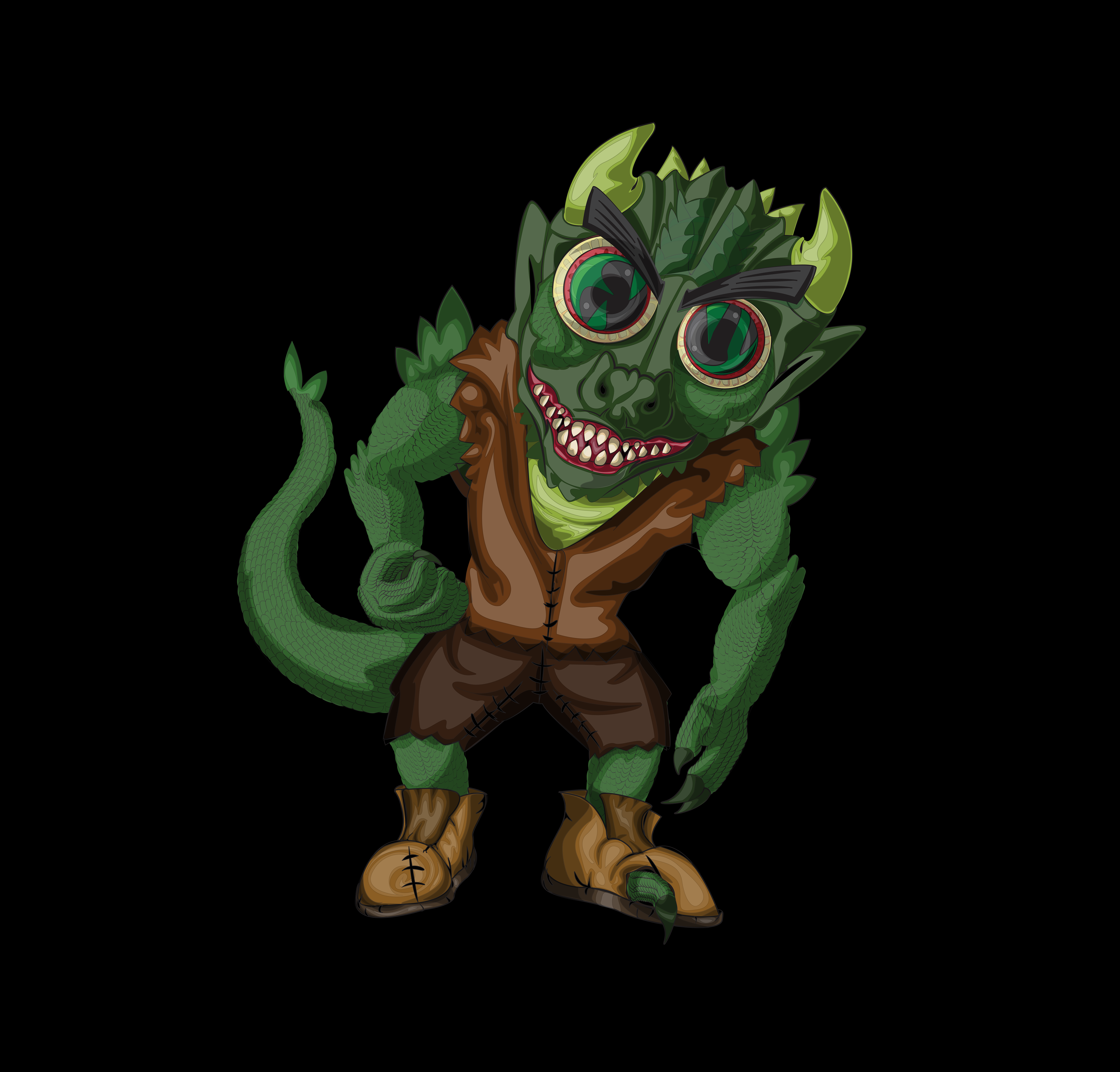
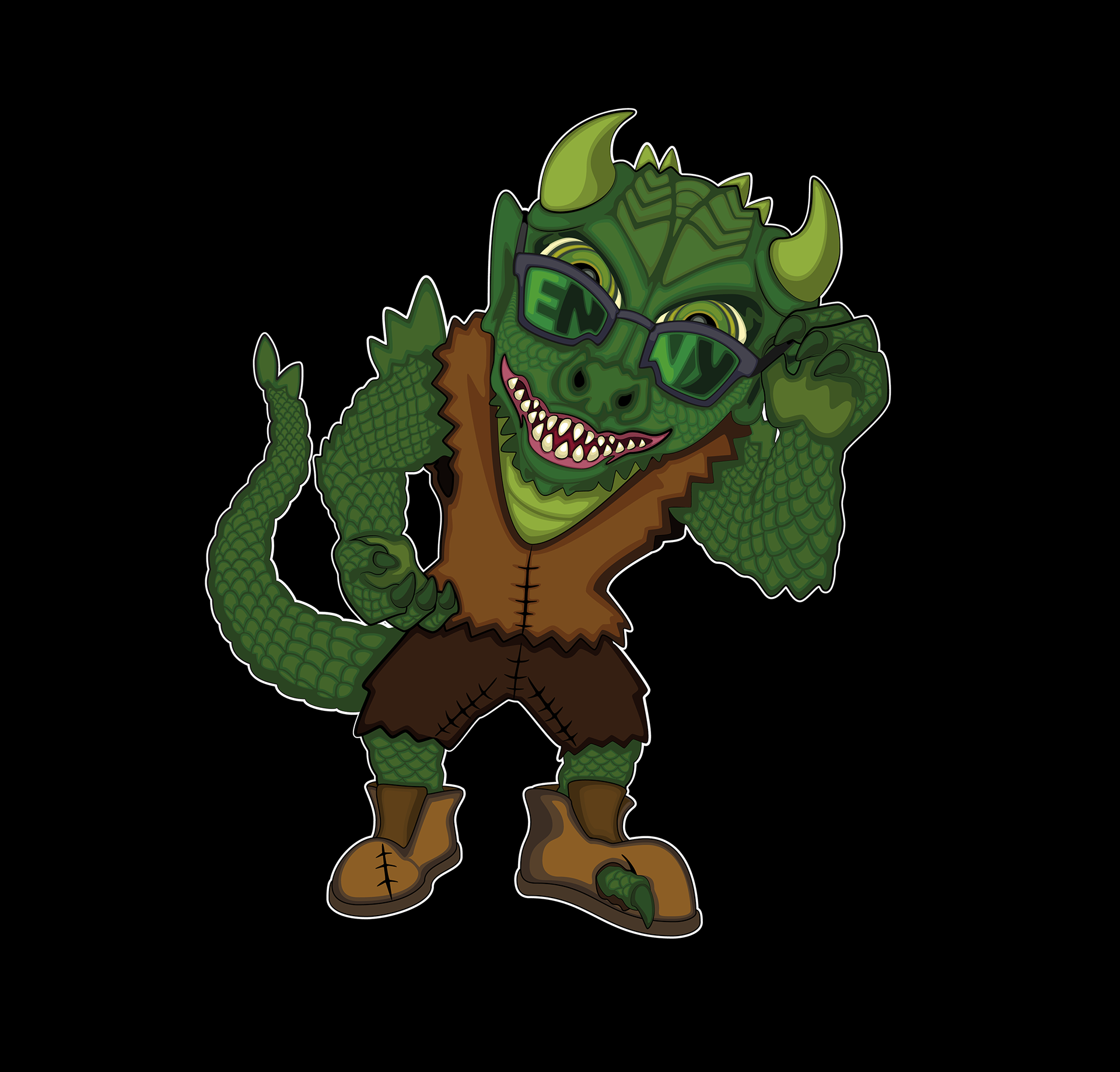
This design is based on a green-eyed monster; Envy. I wanted to make the design as lizardy and demonic as I could for the sin, even putting it in tattered cloths, as an understatement of how much this creature envies others. Originally the word Envy was written in the eyes to have the whole meaning of "GREEN EYED", but then realised the word wasn't legible enough.
So when I ended up amending the designs of the sins especially with Envy I opted to give Envy a pair of sunglasses and have the word written there. to serve two purposes; one making the word legible and adding something more intimidating to the character but it also allowed me to reposition Envy's left arm to look like it's pulling the sunglasses down. Instead of having its left arm doing nothing and just floating by the side.
Original Design

Remastered Design
Gluttony
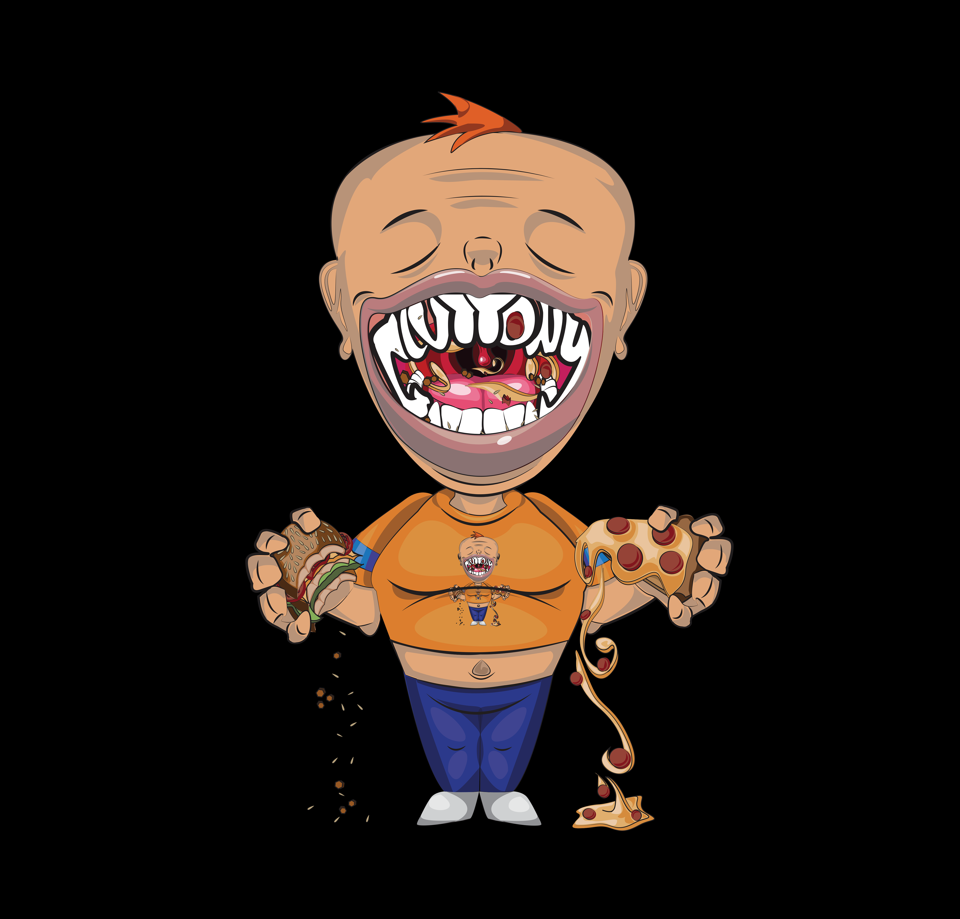
The concept behind this particular design is based on an overweight person with a big head and a big mouth, with the word "Gluttony" being designed as teeth.
This design was originally started as the concept of Pride but with its huge gaping maw and the opportunity to start adding words hence gluttony in the teeth, it made more sense, especially when the original idea for the character can be seen for Gluttony having the design on the characters Shirt.
The reason why the colour orange was designated to the character, is that it is commonly seen in media and across the internet, hence why there's a lot of orange-yellow, in the design, especially with the Ginger hair, orange stains in the teeth, and orangish food and a tanned slightly tanned bronze complexion.
The reason why the colour orange was designated to the character, is that it is commonly seen in media and across the internet, hence why there's a lot of orange-yellow, in the design, especially with the Ginger hair, orange stains in the teeth, and orangish food and a tanned slightly tanned bronze complexion.
Original Design
Remastered Design
Greed
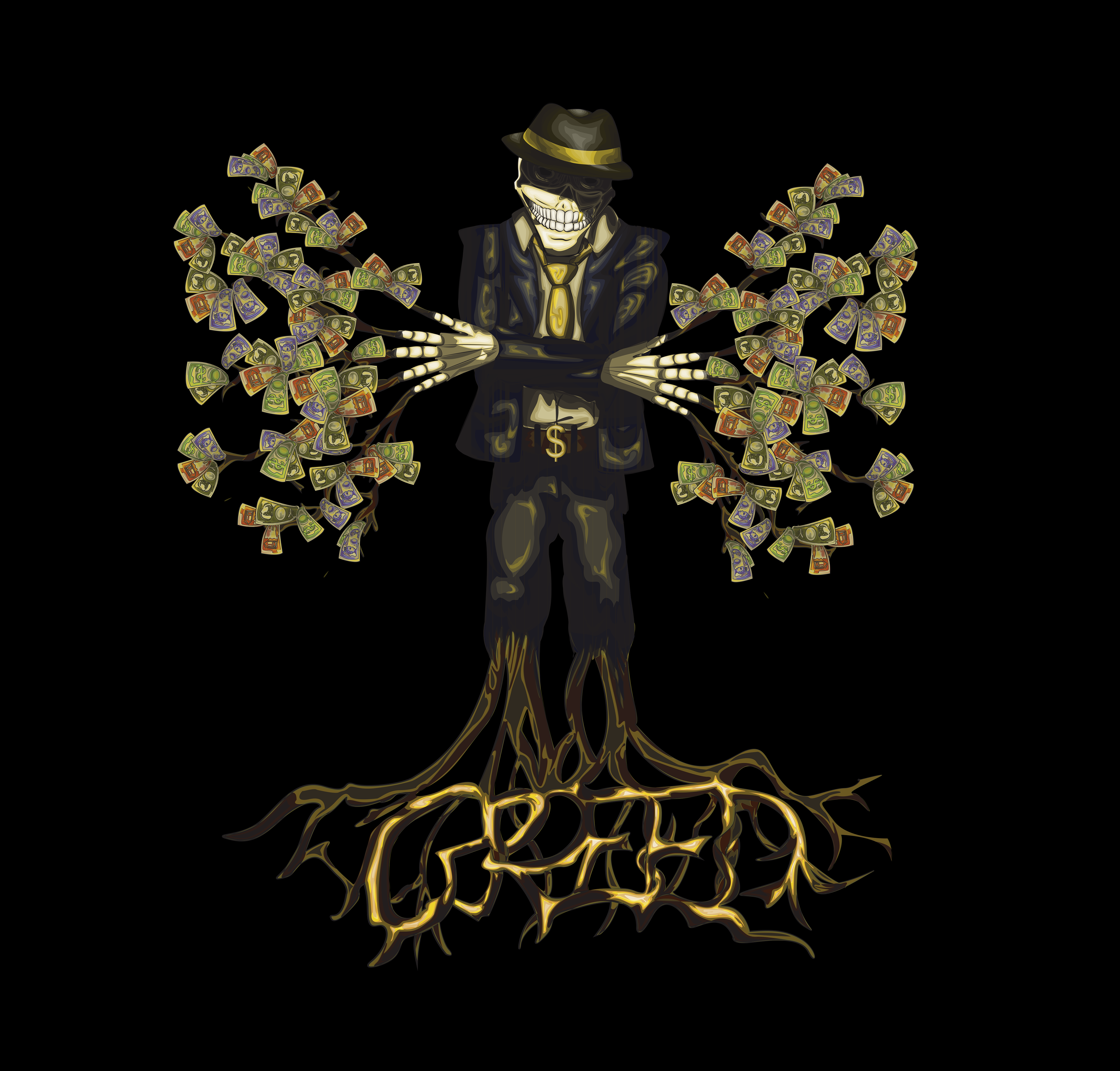
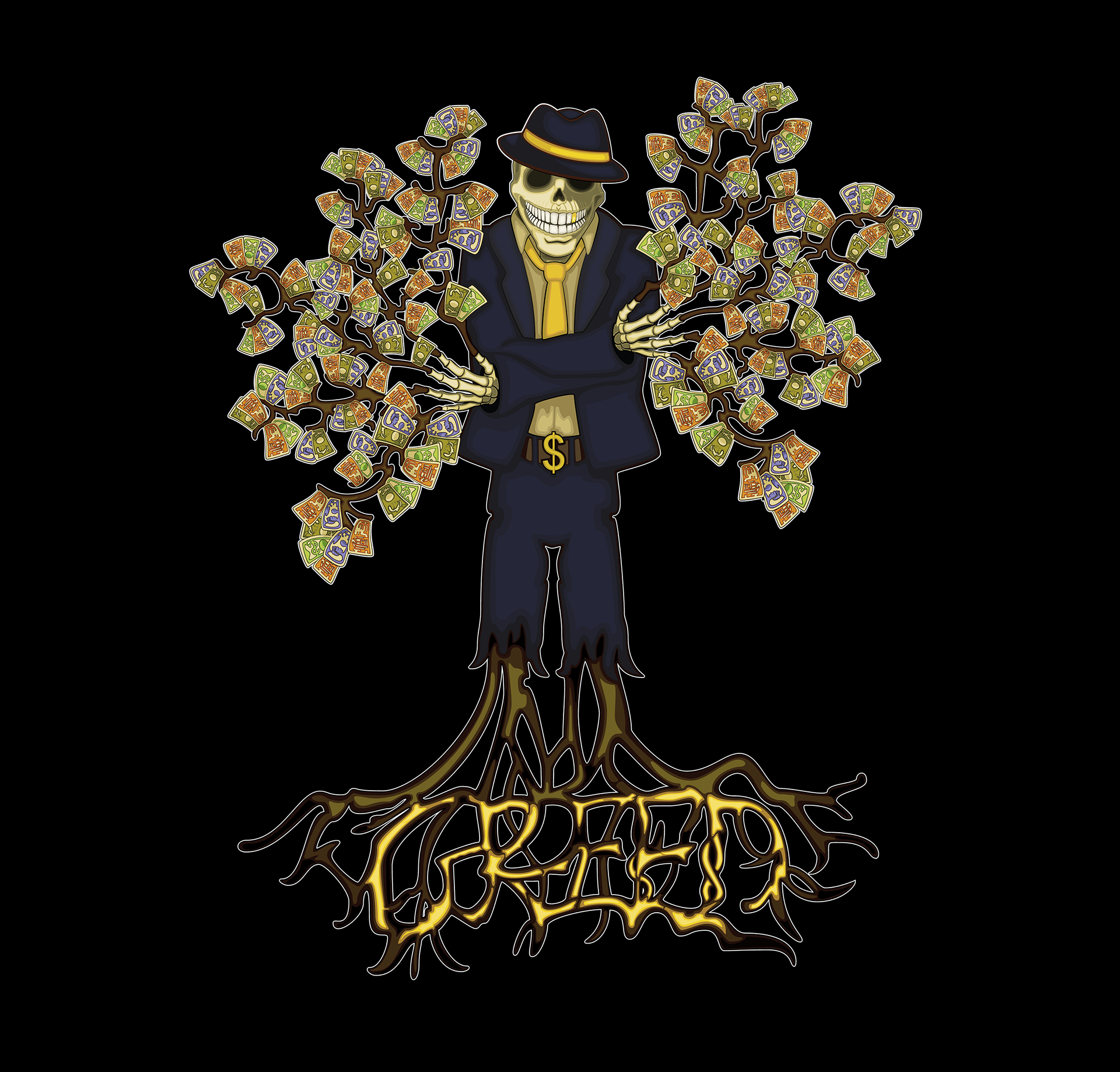
The concept of this design is based on a businessman mainly a traditional depiction of a banker or Mob boss. With tree-like appendages coming out of the fingers with money looking to be growing from the branches this depicts how banks and trees both have branches, while playing off the saying money doesn't grow on trees. All while roots are sprouting from the legs to invoke another saying that greed is the root of all evil; which is why the word greed can be found there in a gold leaf style aesthetic.
In the remaster of the character, I improved the clarity of the design and made the colour more saturated and vibrant while improving the shapes in the design to allow for a more fluid natural look. To emphasise the colour associated with the sin this being Yellow & Gold, while throwing in some dark navy blue to allow for that striking contrast. So it's more clear and not as muddy as the original
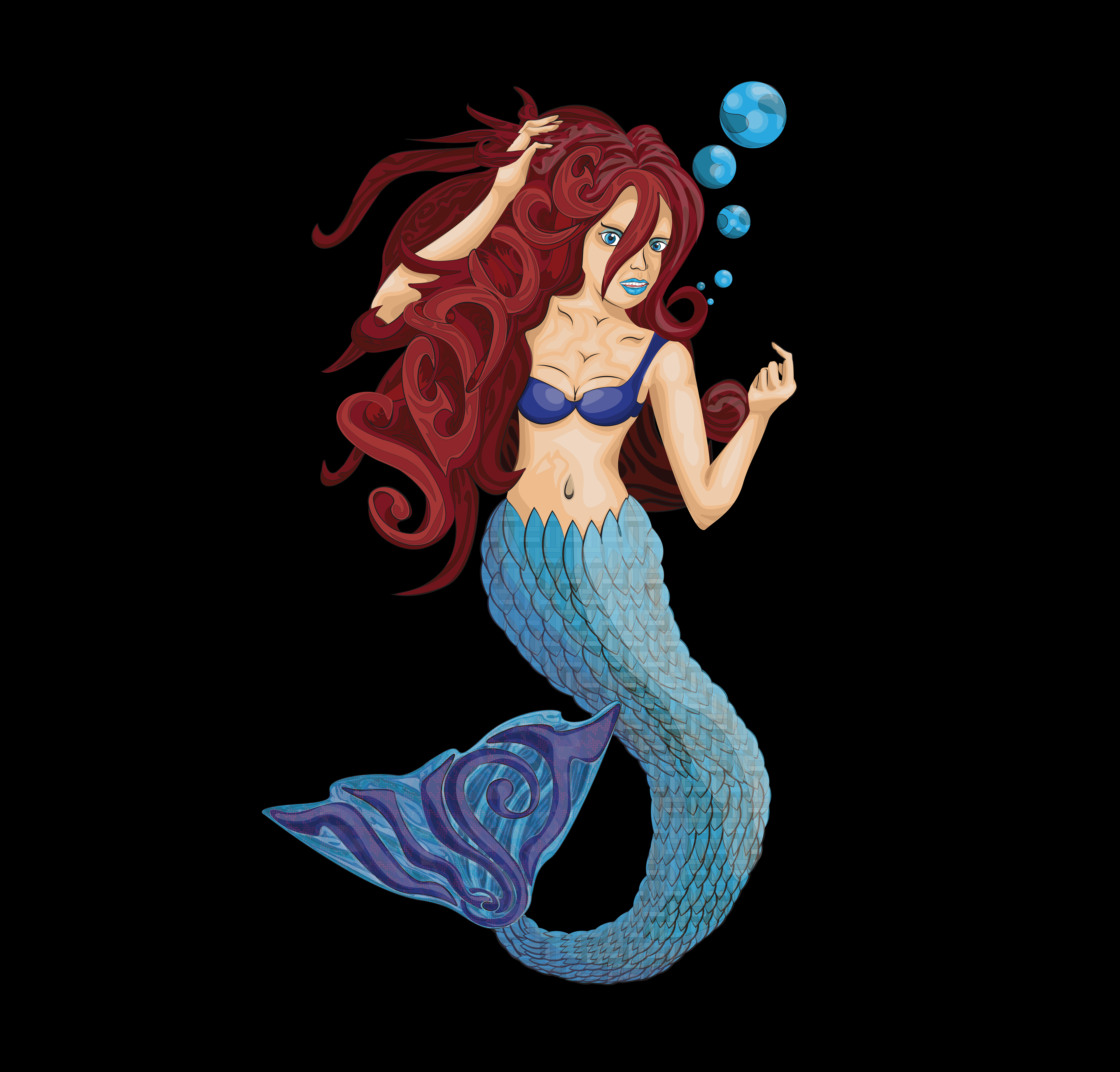
Original Design
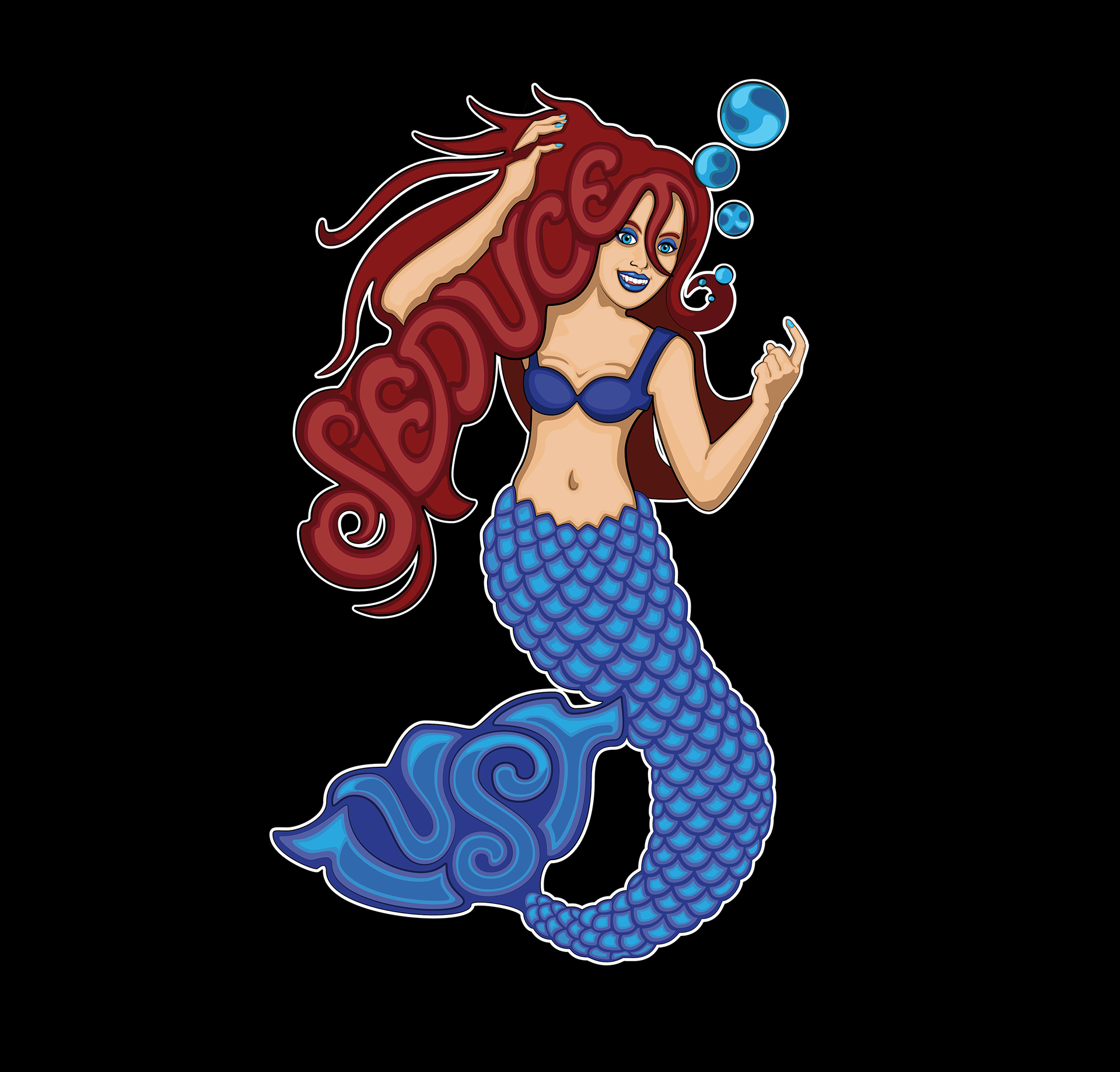
Remastered Design
LUST
For the concept behind the design of Lust is based on a Siren or Mermaid, as mythology dictates they would lure men to their deaths with seduction techniques and singing. There is one design trope I did adapt into the piece which is the red hair from the little mermaid. The rest of the colouration is linked back to the sin colour of royal blue.
So with that in mind, I placed the words lust, seduce and sex in the design; sex is the most subtly hidden word in design while Seduce can be seen within the hair and Lust is visible on the tail fin.
So with that in mind, I placed the words lust, seduce and sex in the design; sex is the most subtly hidden word in design while Seduce can be seen within the hair and Lust is visible on the tail fin.
When I came back to revisit the design to enhance the original concept I tidied up the way the words looked in the respective areas. Reworked the hands and face shape to be anatomically correct and how they're positioned. Recreated the scale pattern on Lust's tail. Before ensuring the saturation of the design was improved and read as more vibrant.
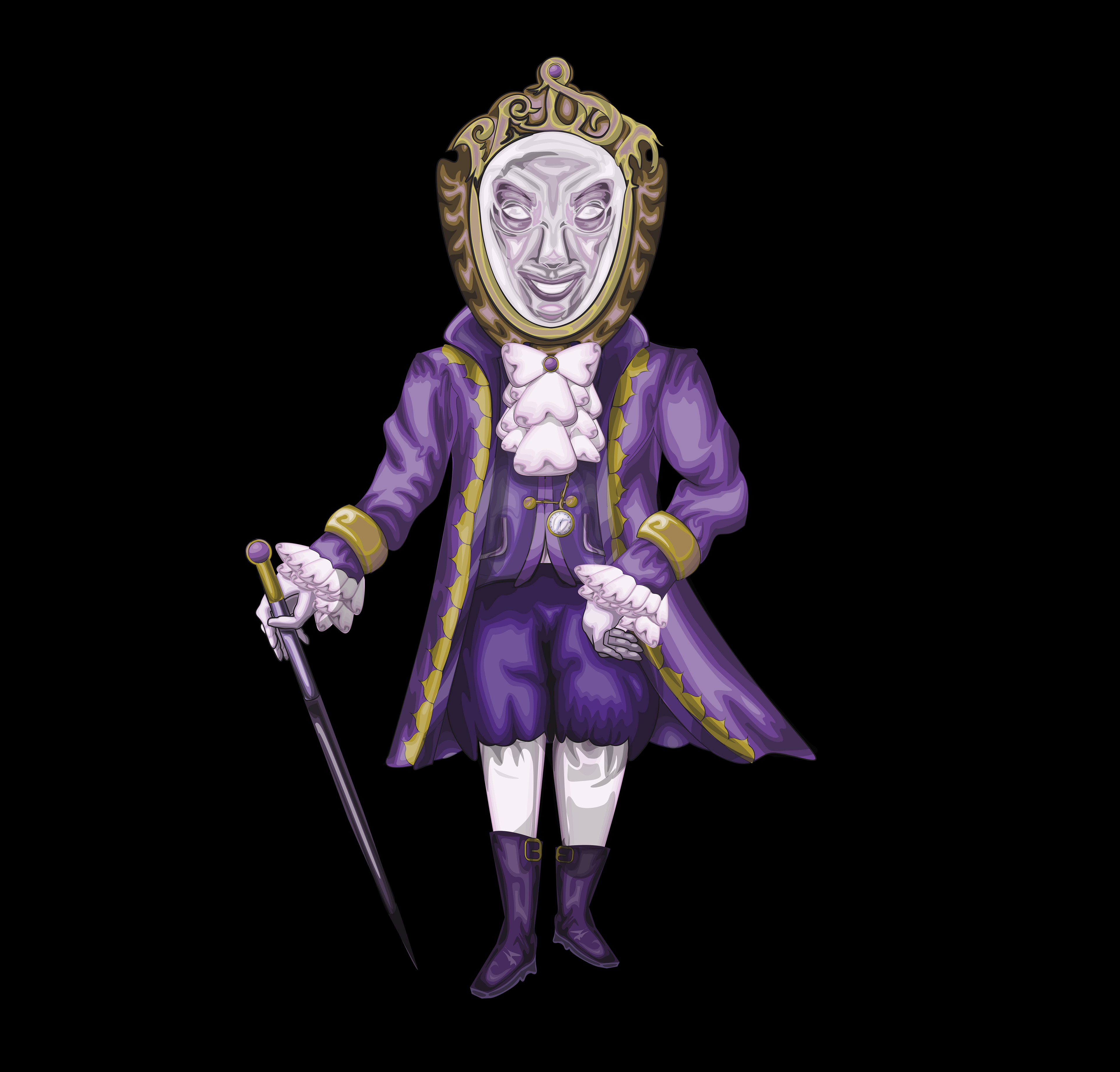
Original Design
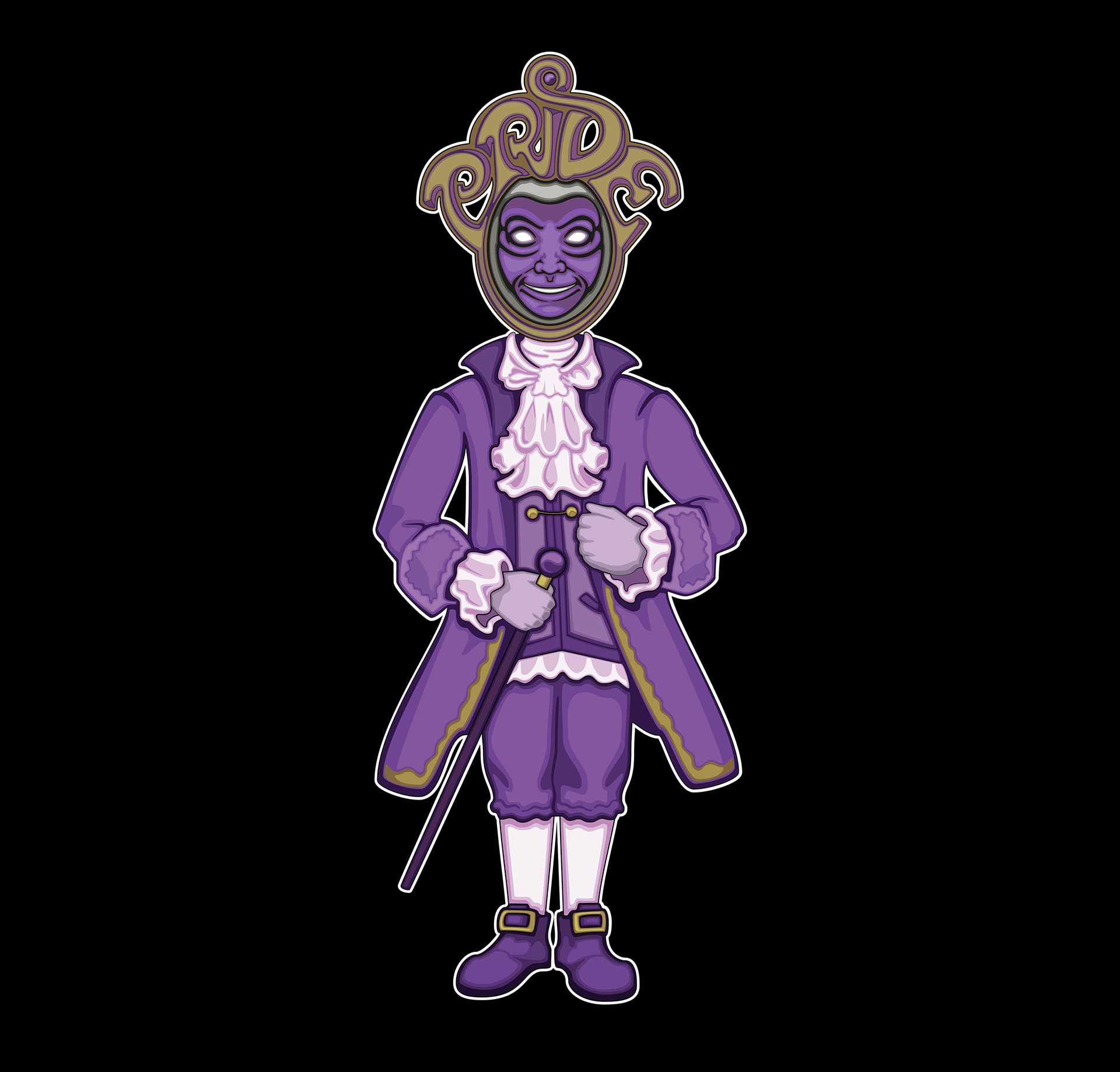
Remastered Design
Pride
When designing the concept for Pride I wanted to mirror what is commonly portrayed throughout history, that being somewhere between the 16 hundreds to the 18 Hundreds of nobility. Being more particularly French nobility mainly an aristocrat. Then playing back to the Brothers Grimm Fairy Tails of Snow White, in regards to the magic mirror used in evil queen and the pursuit of her vanity "the fairest in the world". While having Pride's face based on the concept of a vanity mirror for the head; while having the word Pride act as part of the frame to double up as some sort of crown.
When redesigning I went in with the idea of doing a complete overhaul to the character's design. Making the body more symmetrical. altering the proportions of the design and completely altering a few sections to make more sense. Slimming the design down in areas, and repositioning the hands to be more tucked in. Making the frame more exaggerated in size, while reducing the size of the face. Altering the legs and the shoes the Pride is wearing. Then after developing my style of shading illustration, where I applied this to the frills and puffy undershirt of the design allowing for the design to have a colour tinted neutral colours.
Original Design
Remastered Design
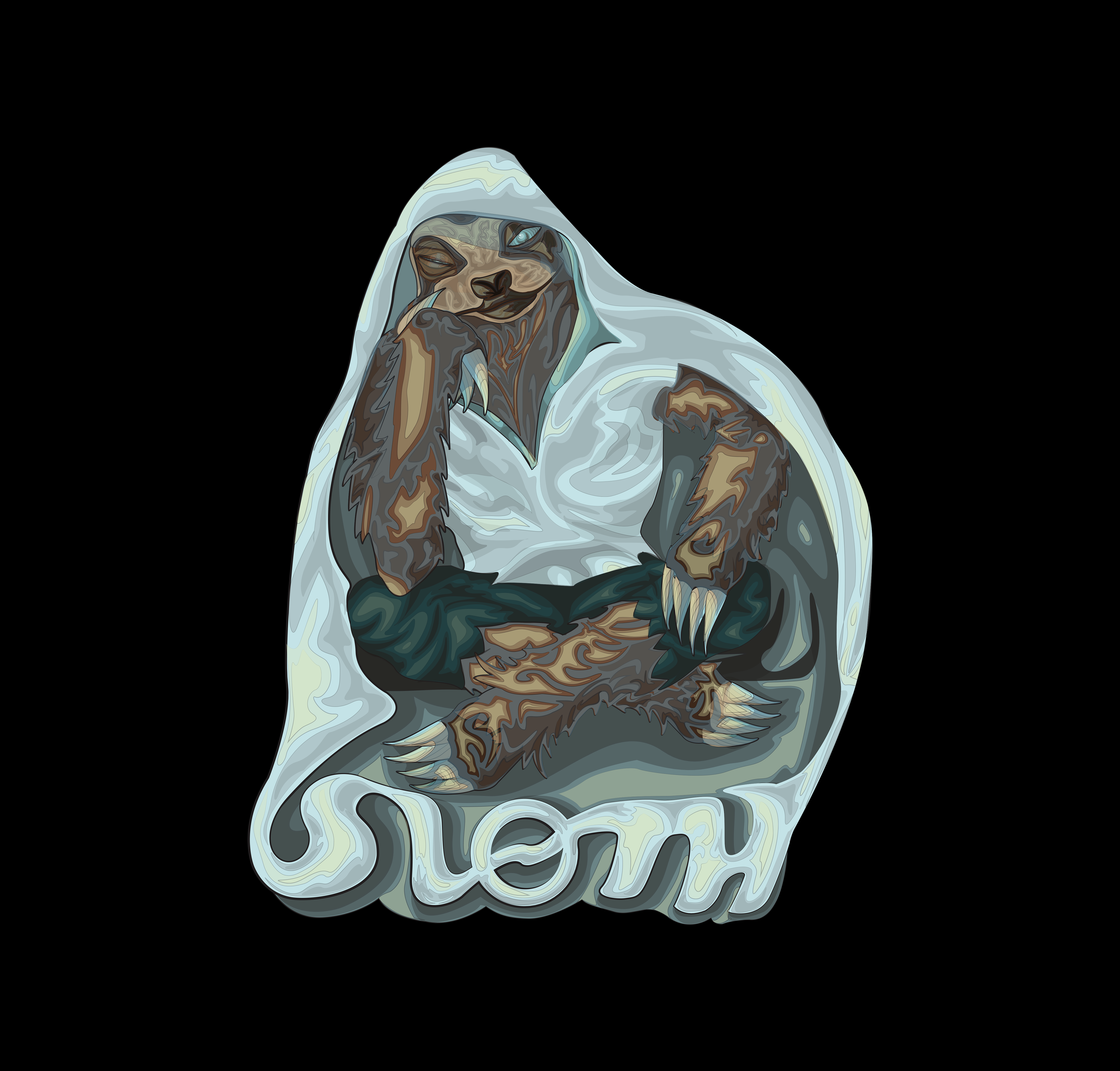
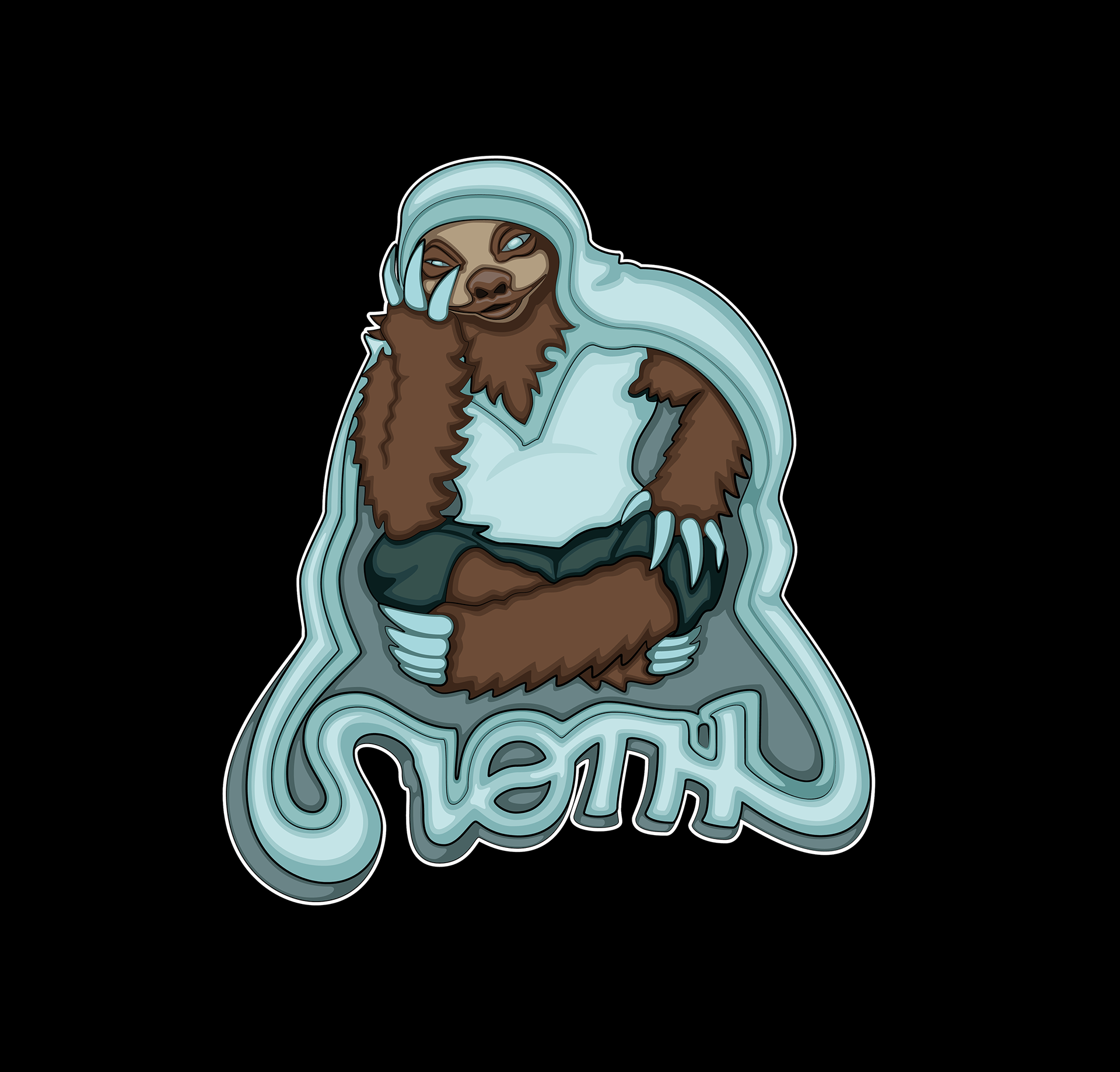
Sloth
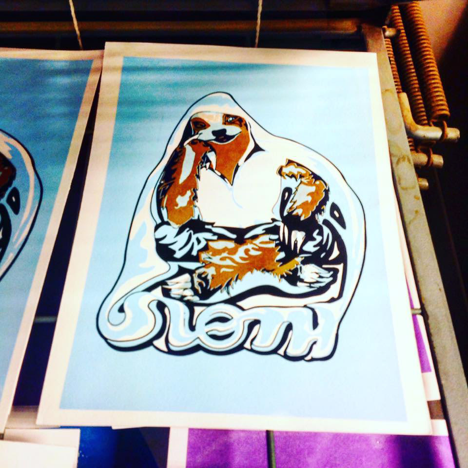
This design's concept is based on a sloth wearing/sitting on a blanket with the word sloth being placed underneath. due to the sin being depicted as lazy and apathetic. A sloth is slow in nature. The colour for this sin is a light Pale Blue.
Other than doing a general tidy-up of the design, making the design less busy, I repositioned the claws, gave Sloth more fur around its neckline and amended the style of the work or whatever....

Original Design

Remastered Design
WRath
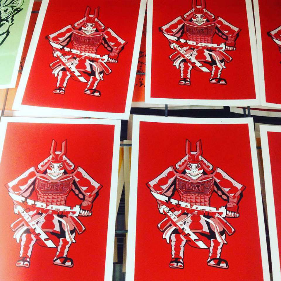
Wrath's design is based on a 12th-century Japanese Samurai with the words "Wrath" designed on the swords and fury displayed on the chest plate. Other elements added to the design would be the Japanese Oni Demon inspiration to the face; while using traditional Japanese Kabuki Theatre makeup on the face, with red to symbolise strength and passion; within the context of the sins Red commonly represents Wrath.
When revisiting the design of Wrath and studying samurai armour more closely I added more rounded elements to each plate to show how it would wrap around parts of the body, applied more emphasis to the shading of the face under the helmet, so it looks like it's placed and covering. One key major difference between the original and the redesign is the word fury on the chest plate being translated into Japanese Kanji, which makes the plate look like it has been cut into.
Finally one of the key changes in the design is the Kartana being slightly lifted in the design, altering the position of Wrath's Right hand to be more visibly raised. changing the colour of the hilt to a copper red. Then adding highlights to create a light reflection of the blades.
Application
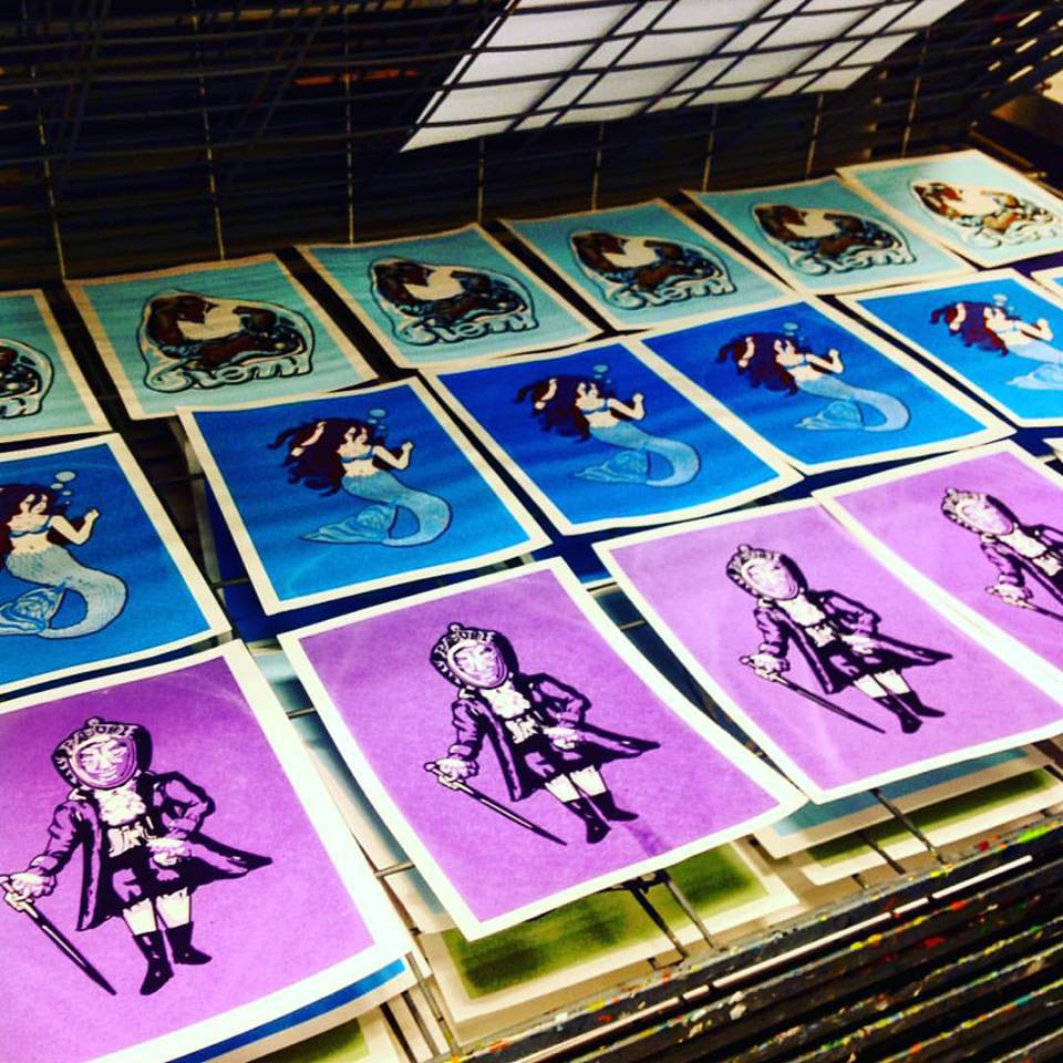
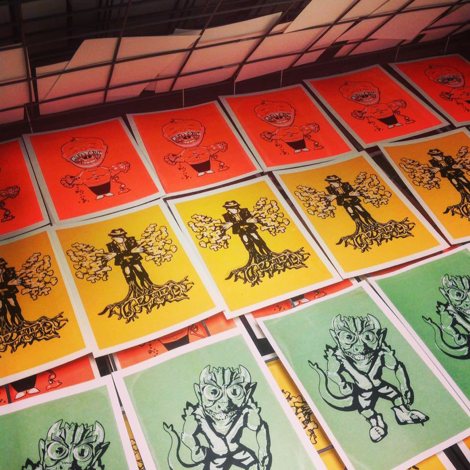
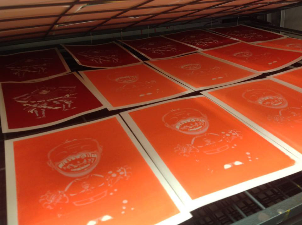
Next was to then translate the design onto different mediums e.g. either in screen print format or turned into stylistic t-shirts. For my first attempt back in 2015, I took them to screen printing and enjoyed the process of applying through trial and error.
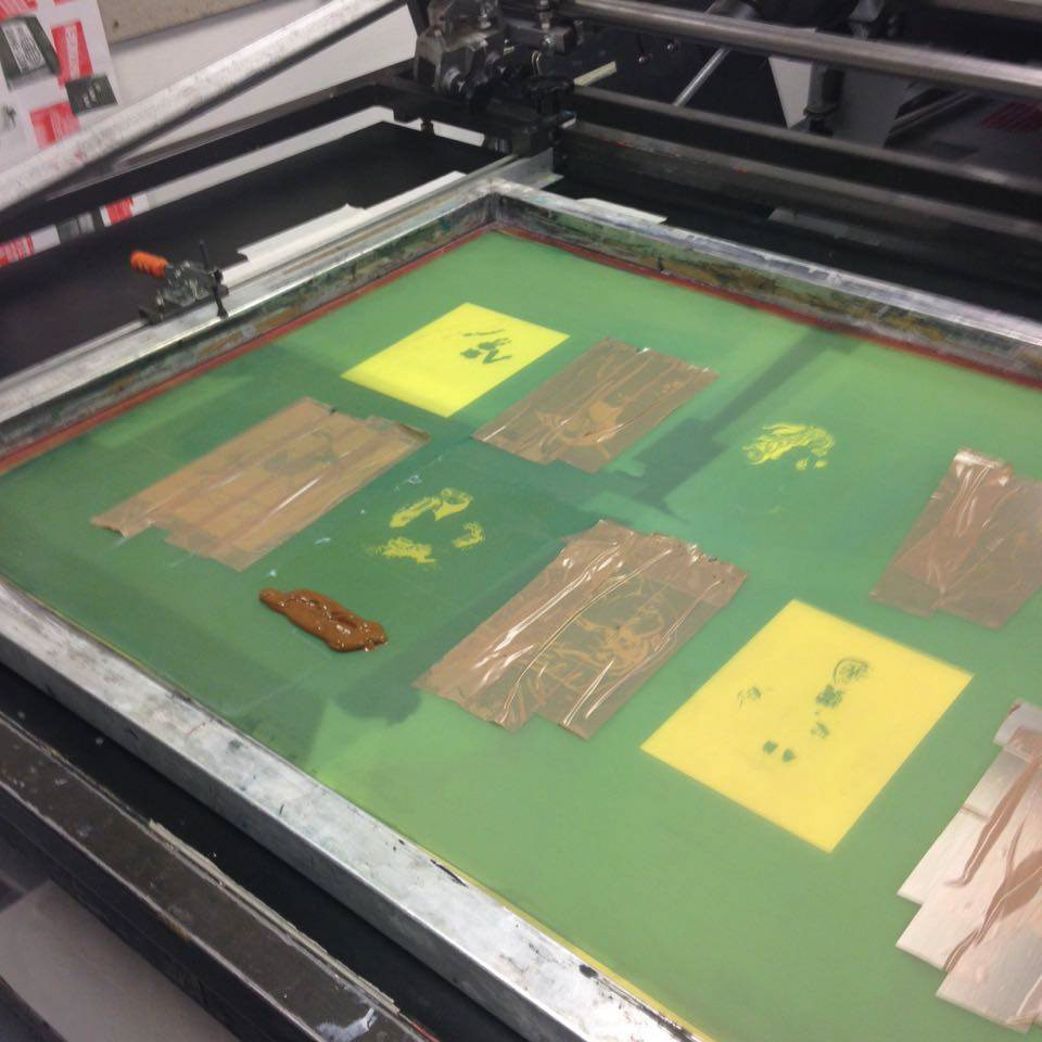
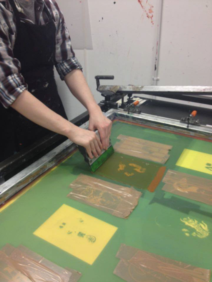
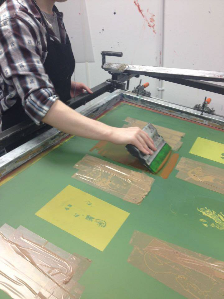
Screen Prints
This was my first attempt at screen printing, though I am proud of the outcomes and it is my first attempt at screen printing my mini-project, I took the designs into learning the application of the main colour and then applying and building off halftones and secondary colours.
However I quickly learnt a major lesson in my design process, less is more. Even with the revamps looking more polished, the is a maximum of 3 to 4 layers of colour between them. This was one of the major decisions that made me want to revisit the project.
