Initial Sketches
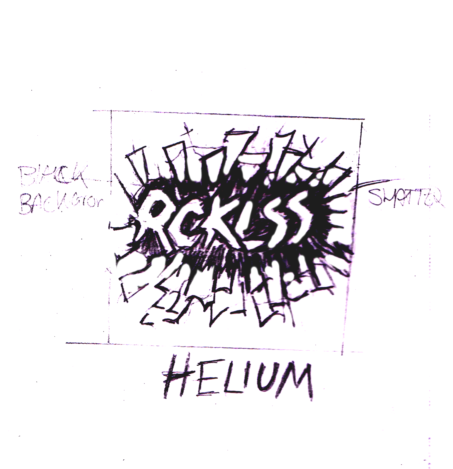
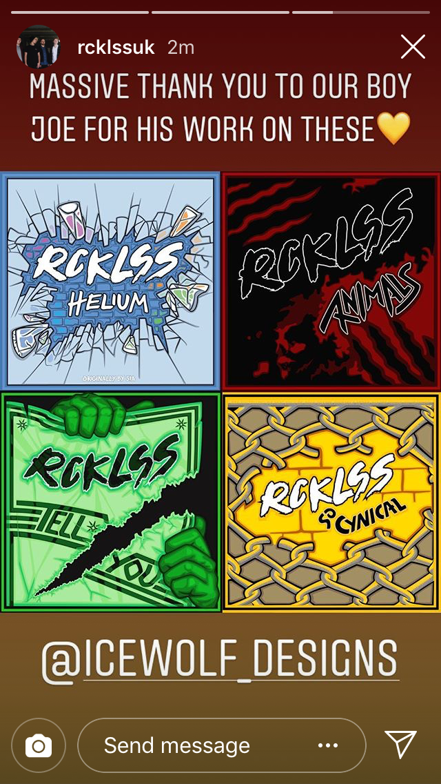
RCKLSS Helium cover, this can be found on Spotify as of the 1st of September 2018
The cover for Helium went through a lot of design changes and styles before finally settling on the main final style. It was designed with the idea in mind to look at a shattered mirror, as mirrors are known to reflect light and colour. This was decided by the band as the best direction for the design as a whole, this reflects the style of RCKLSS with their Hard Pop Genre of music. They also produced a music video where brightly coloured powder paints were featured; this is another reason to add bright colours to the design. This cover was originally intended to have the typeface that I had designed for the band and to be used at the bottom of this cover art, it let people know that this was a cover "ORIGINALLY BY SIA." In the end, it was removed and the font was then later reused on the artwork for "So Cynical" and other various promo material for the band.
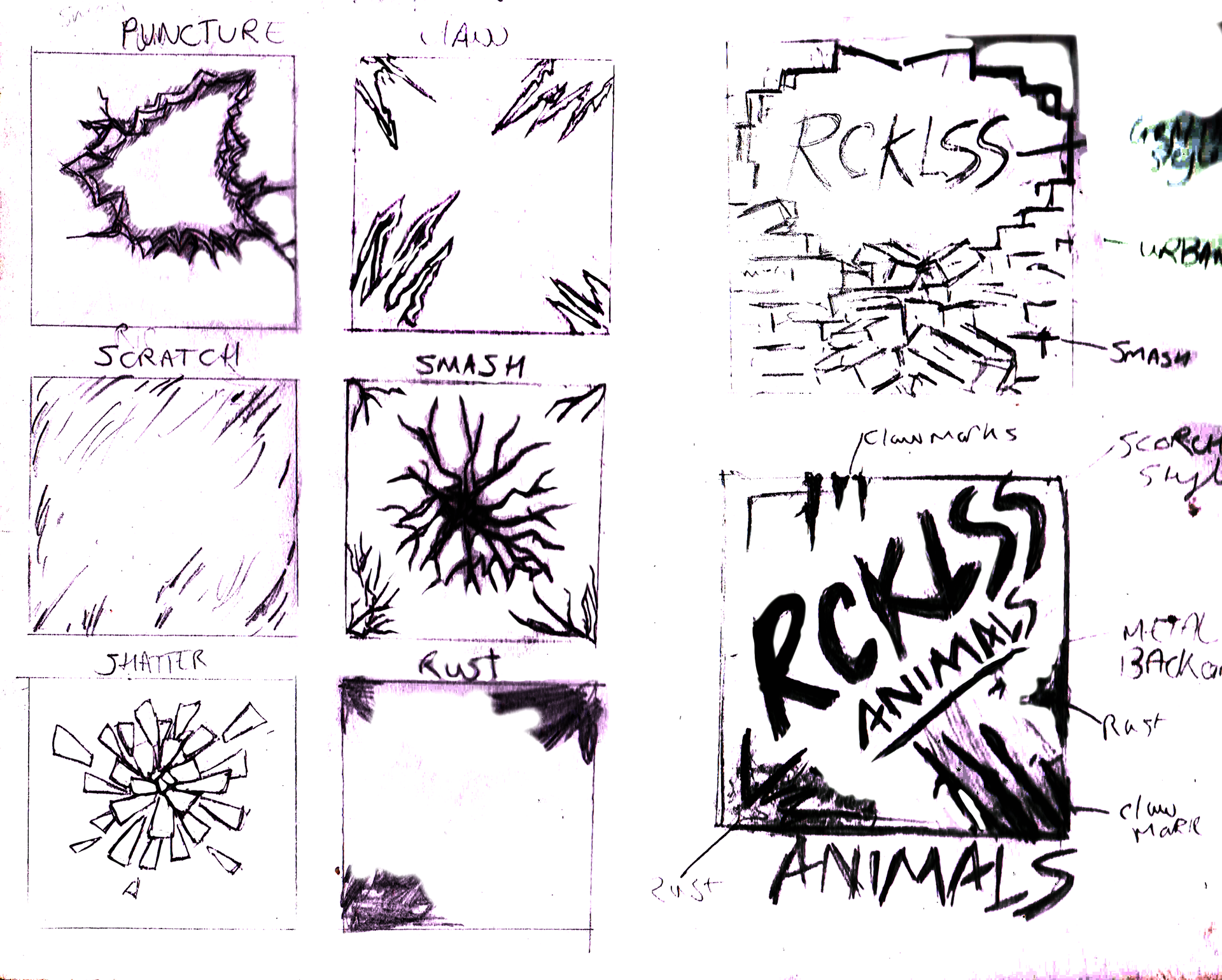
RCKLSS Animals cover, this can be found on Spotify as of the 31st of October 2018
The cover for Animals was the second cover art I designed for RCKLSS and was by far the one I had the most fun producing. After speaking with the band and what they wanted for the cover and what needed to be included, I immediately understood the direction they wanted the design to go in, in respect of the colour used. The only tricky bit of this design was being able to figure out the flow of the rust and blood-like pattern and how to incorporate the clawed marks and the subtle zombie-like skull into the finished design. This links to the music video which is a very zombie-inspired look and takes place in a warehouse setting. So for me personally I feel like this cover hits every note going.
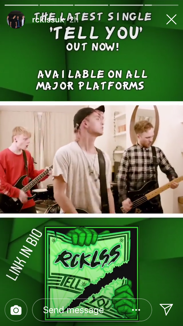
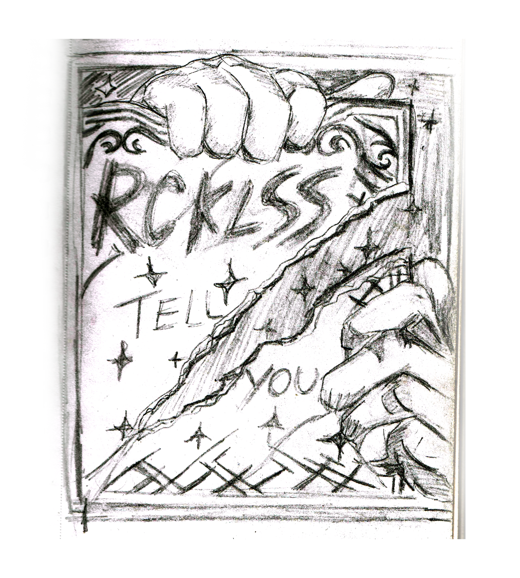
RCKLSS Tell You cover, this can be found on Spotify as of the 10th of December 2018
This was the fourth cover art I created for RCKLSS for their last EP drop of 2018 titled "Tell You." This was a bit of a challenge going into the design, as the concept for this was tricky to figure out in respect as there was nothing to base the theme on, but once I had listened to the song, I was able to decide what elements I wanted to include for me to create a rough concept sketch, once this was done it made it all the easier to move forward. My initial design features a pair of hands that overlap the frame of the cover ripping a crumpled-up piece of paper with the title of the song being "TELL YOU"; to look like they should be joined together, but with the way I have positioned to create the effect of them to look like they've been split apart. thereby reflecting the song's super pumped and edgy energy in the intro. then as the song progresses it becomes very simple and laid back with a visual of the lyrics "we watched the stars one night" being incorporated into the design. For me, the challenge was being able to find the perfect balance of minimal content and a high amount of detail when trying to figure out the creases and how crumbled paper would normally look.
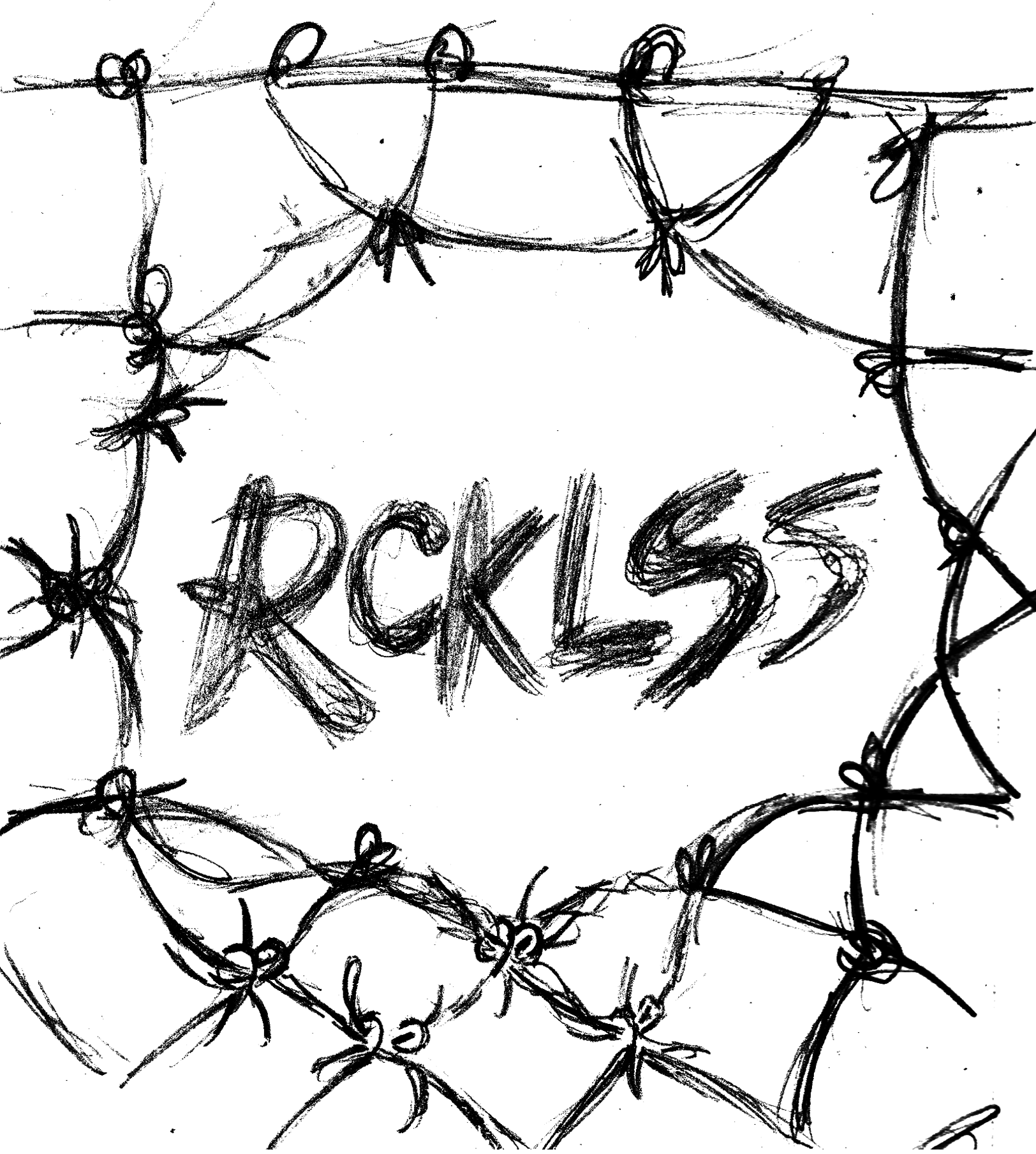
Here is the very first useable font that I developed. This runs alongside the latest commission for RCKLSS, by creating their very own typeface, it can be used on all their promo materials which captures the band's style of music Hard Pop. It is designed in a style that is both rebellious and fun.
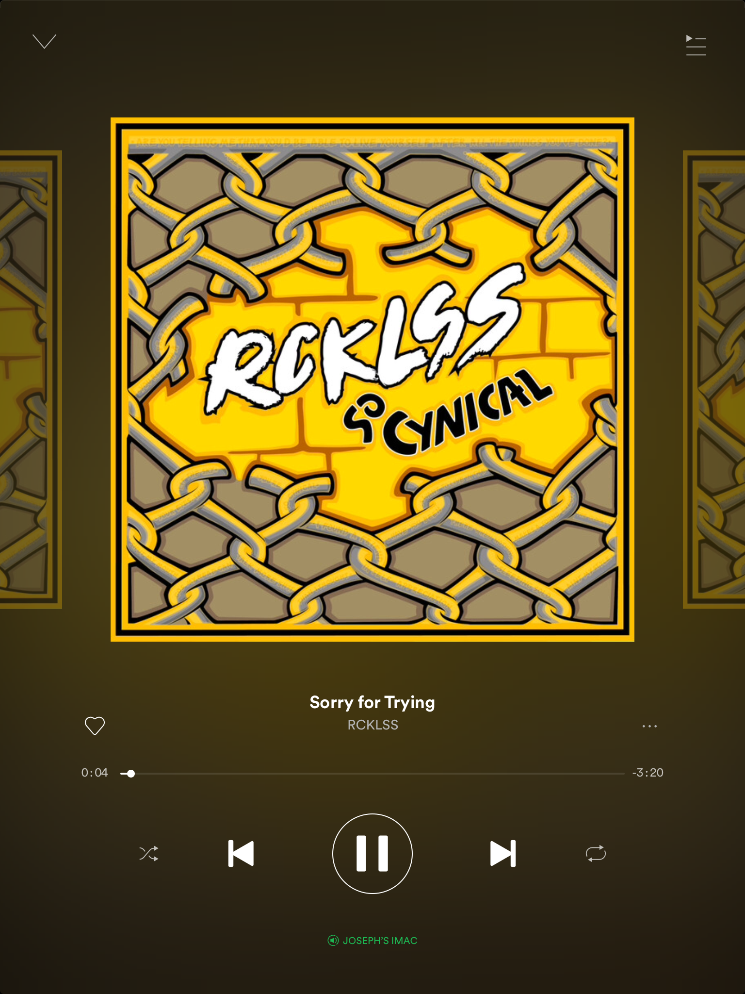
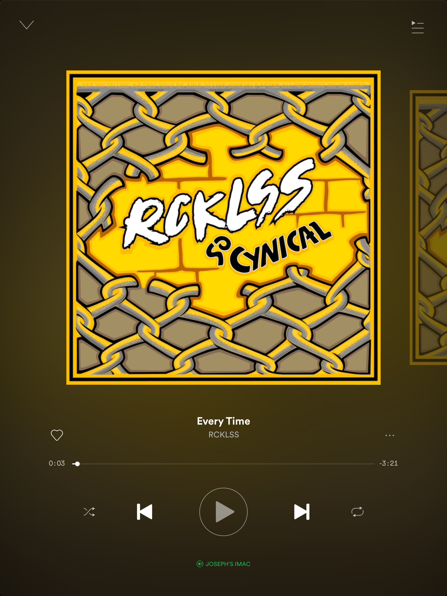
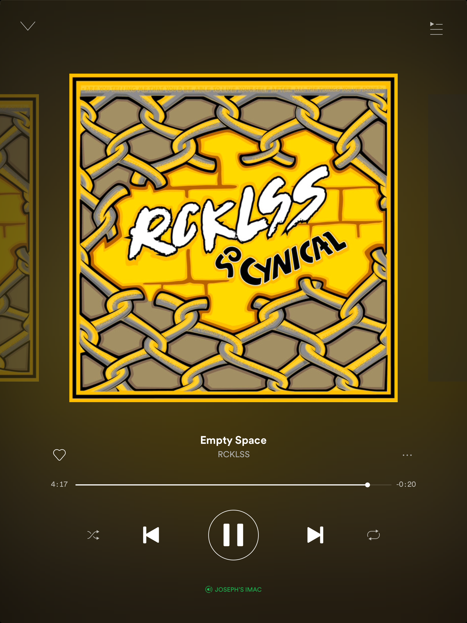
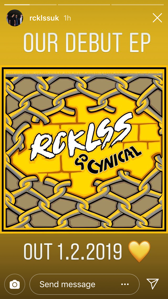
This is the Album cover RCKLSS's Debut Album, So Cynical. This can be found on Spotify, iTunes and Soundcloud as of the 1st of February, 2019.
There were a couple of ideas on how the artwork for 'So Cynical' should look. This was originally the third cover I had designed for RCKLSS even though this had been released after the single 'Tell You'. I pulled a few design elements from the previous covers that were either scrapped or recycled, which were added to the artwork. One of my main focuses for this cover was to fulfil the band's wishes on what should be included on this particular cover art, as such few lyrical easter eggs had to be worked into the design. After throwing a few concepts around, we settled on the idea of the cover being comprised of a broken chain-link fence, which reflects the idea of being cynical. One definition of broken trust, the wall behind the fence represents the guarded nature of being cynical. This also echoes back to the wall of the first Cover art I created for the band's Cover of 'Helium', which was originally sung by Sia. I created the initial layout of the design which included the lyrics on the metal chain links, which created an almost engraved effect. The font that I used to present the lyrics was one that I created for the band, so they have their very own typeface. This is both unique to this cover and featured on future promo for the band.
