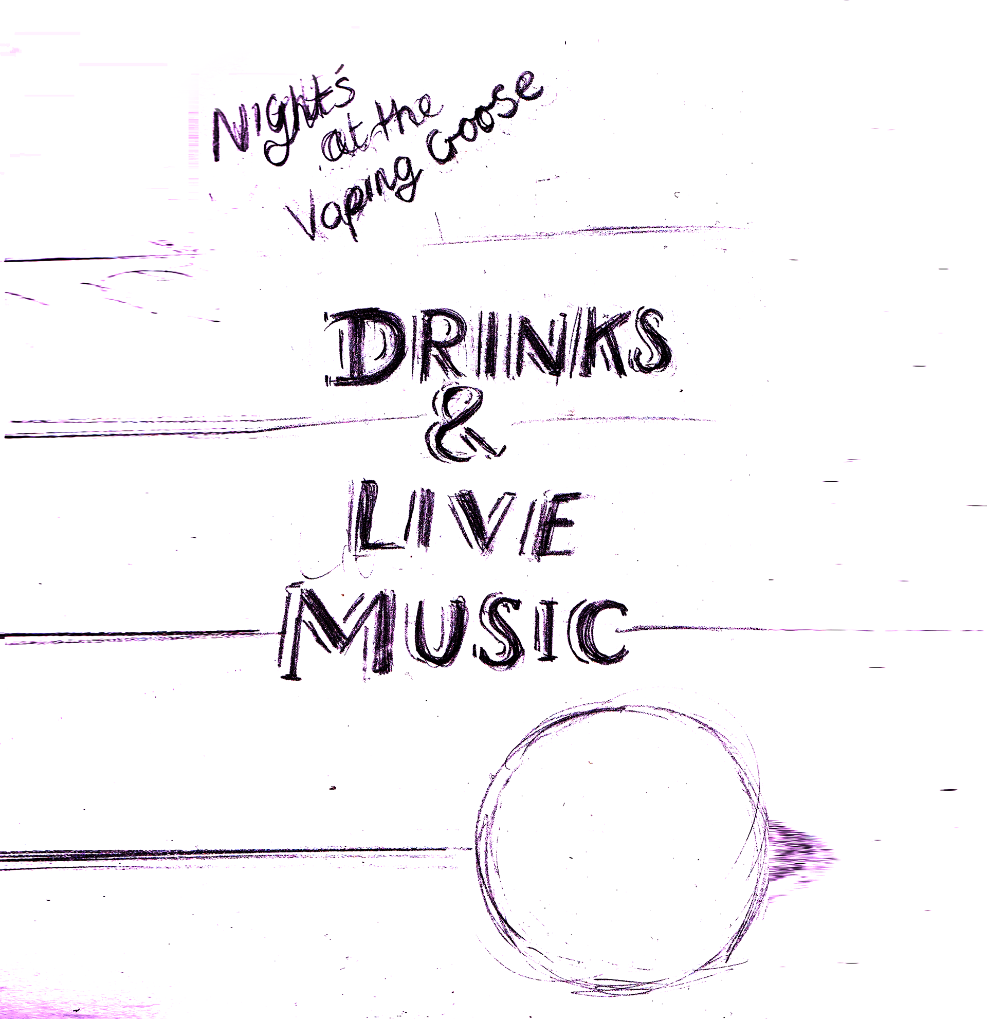
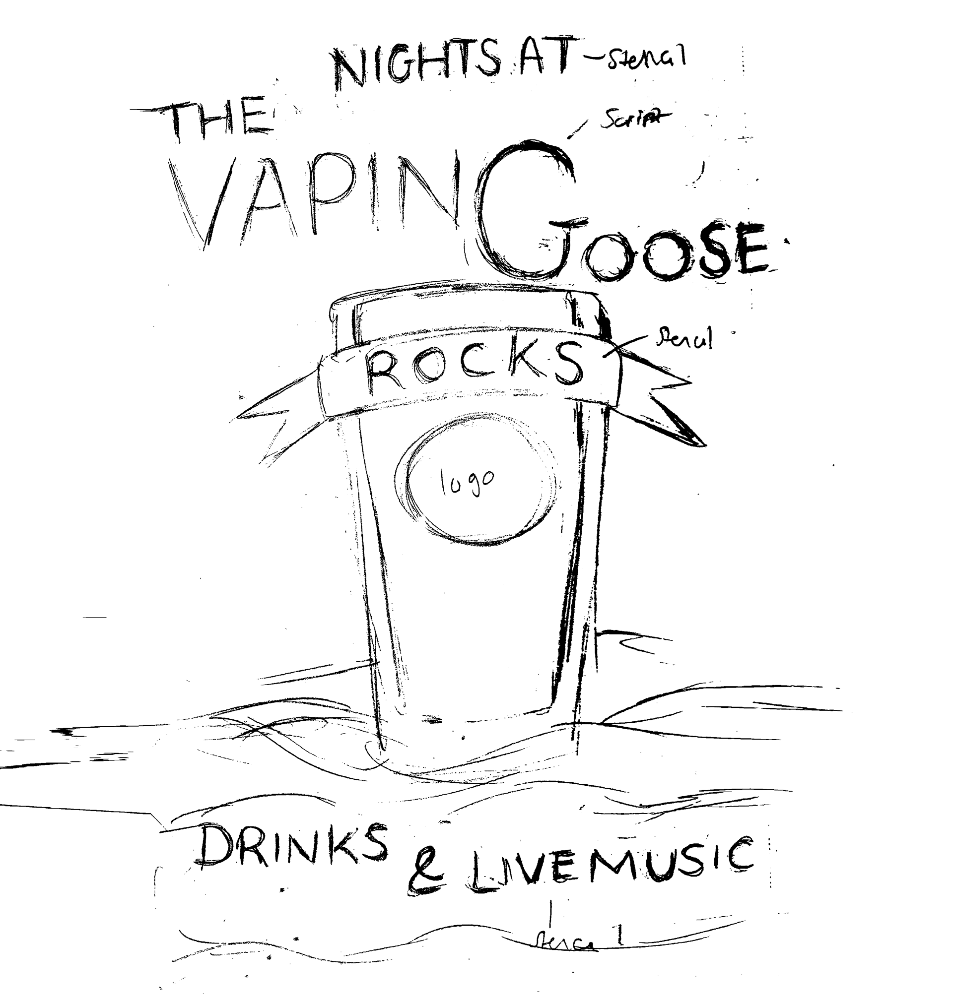
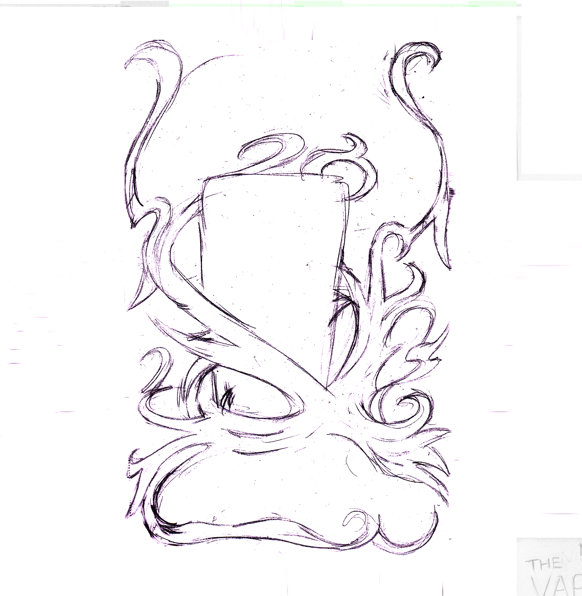
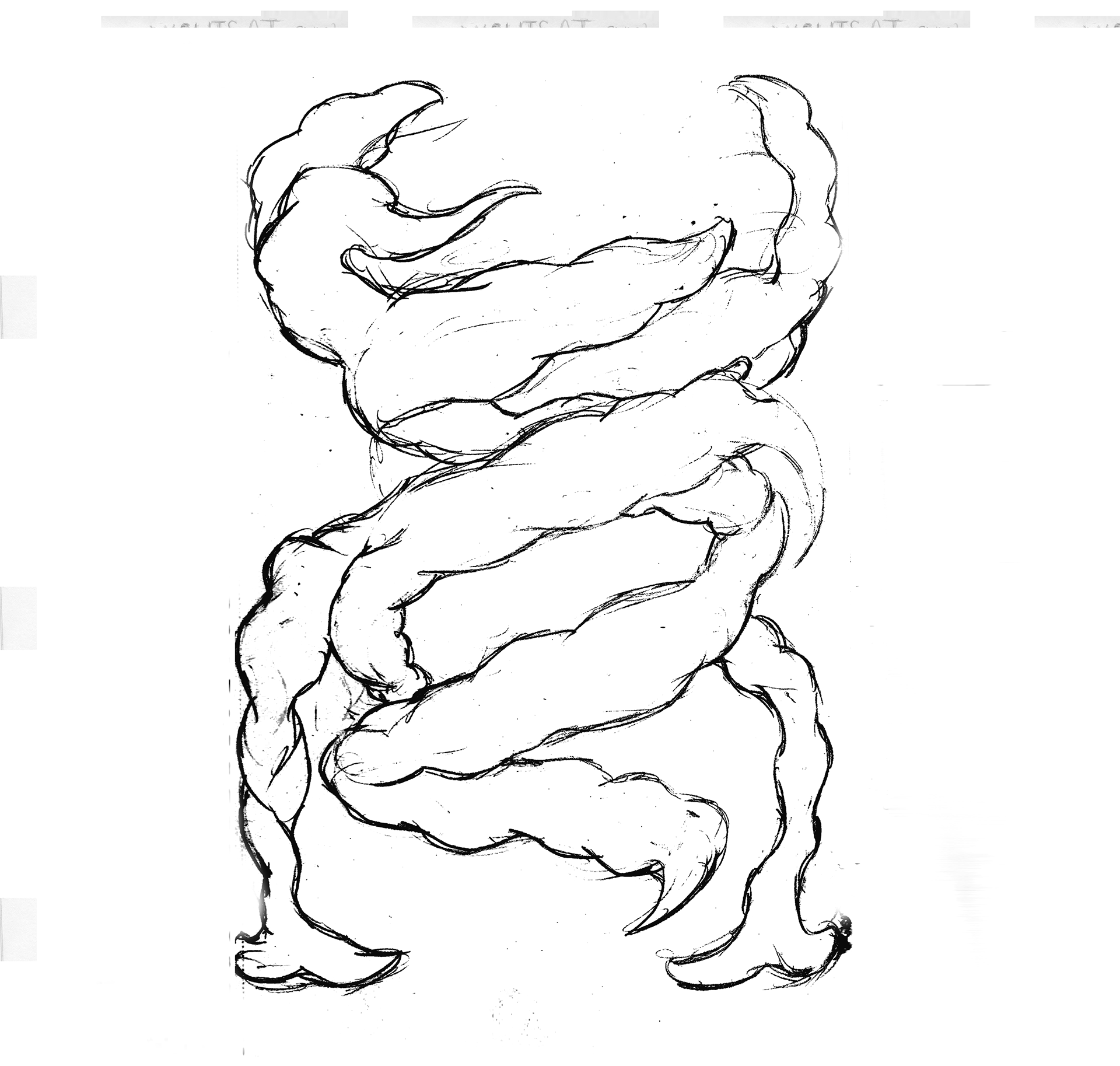
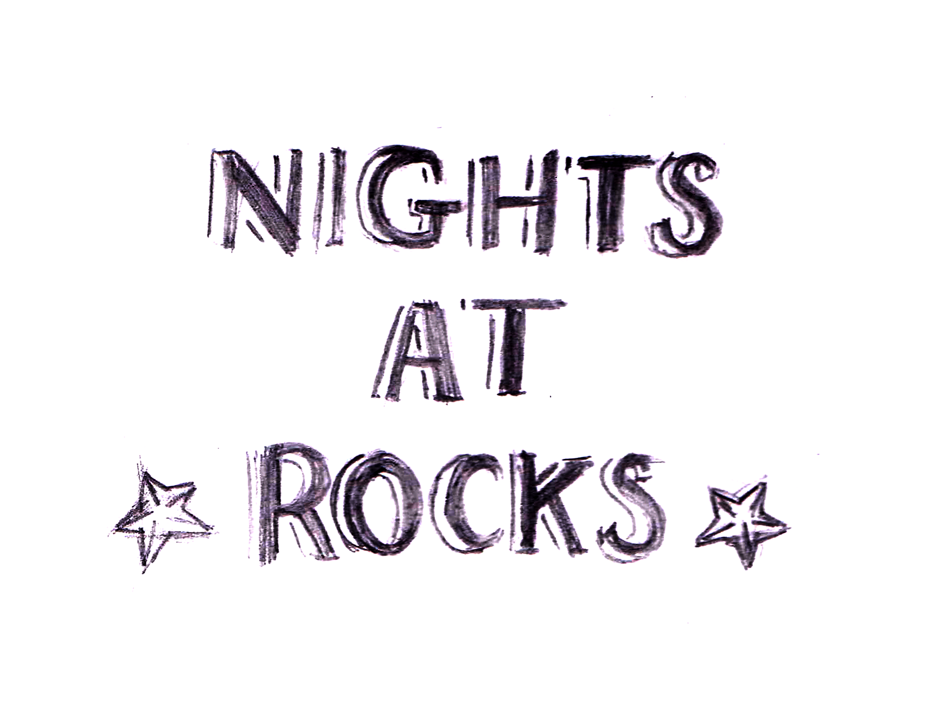
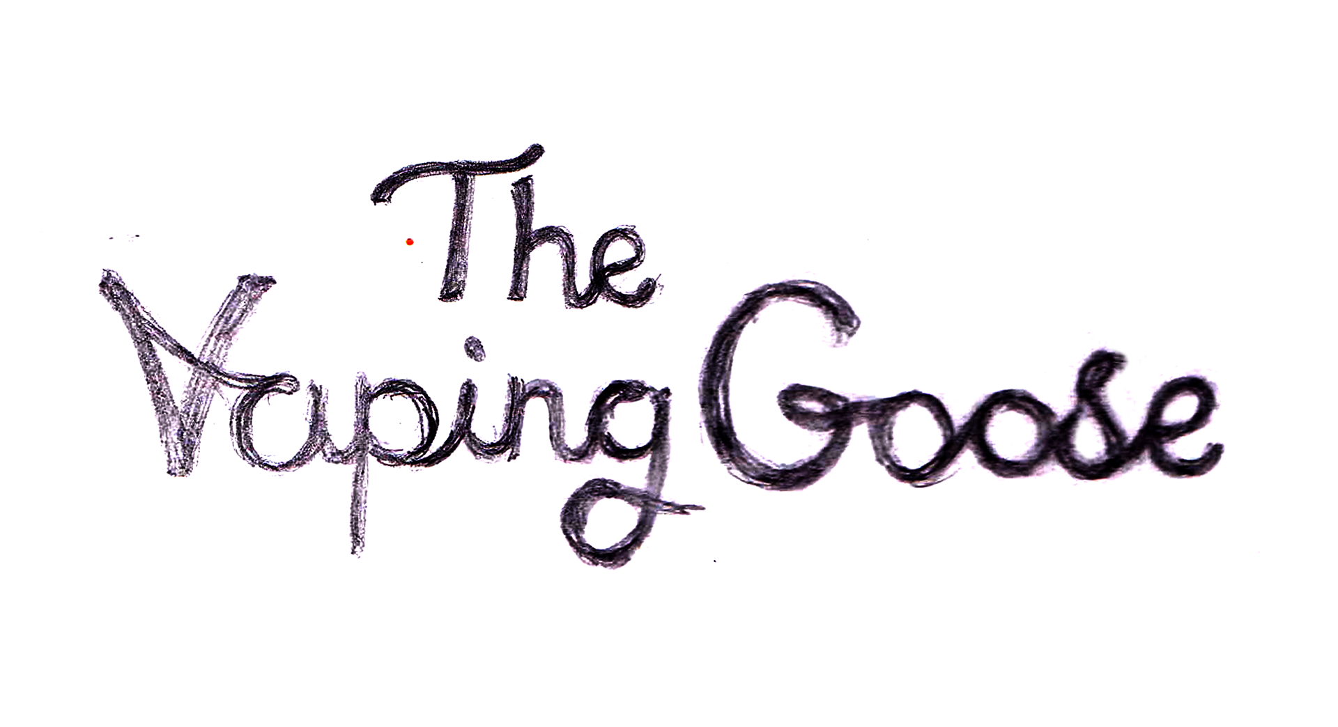
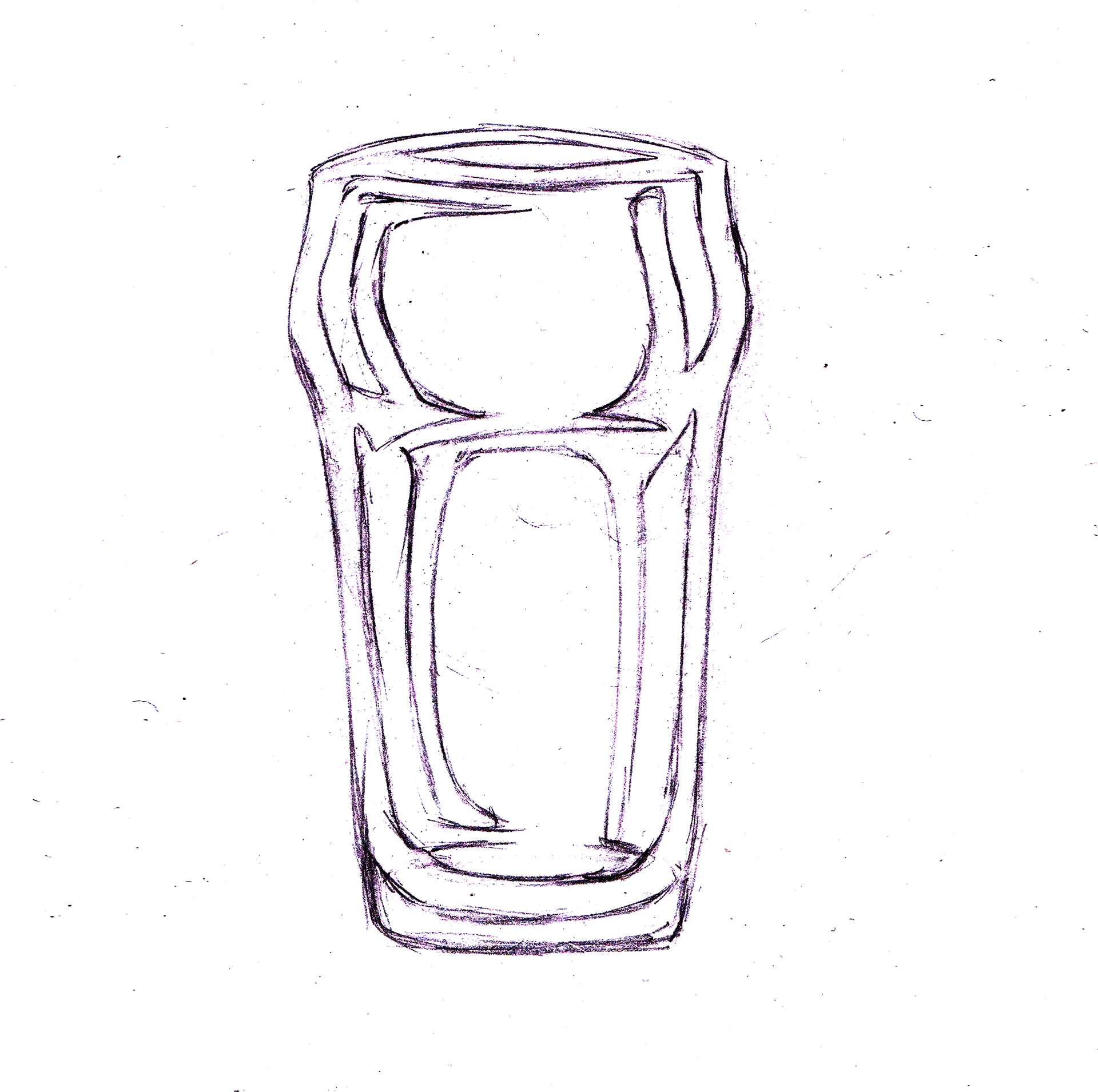
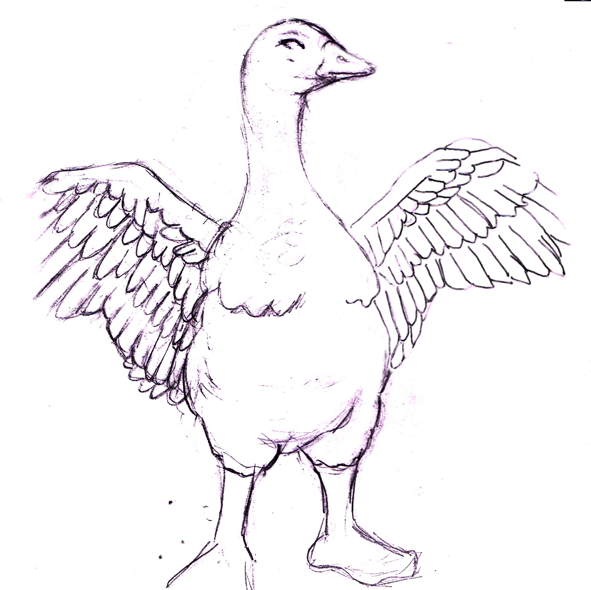

Having sketched out various poster designs and concepts as a starting point for the design, I showed the client the initial sketches and talked to them about which concept would work best.
I requested what information was needed about the venue and what wording was to be used to convey a general message to be displayed. “Swing by the Vaping Goose for live music, awesome drinks & great atmosphere.” would be the generic poster message.
The client didn’t want to advertise any particular dates and times for the venue as it would be open and it would be just a general promo poster.
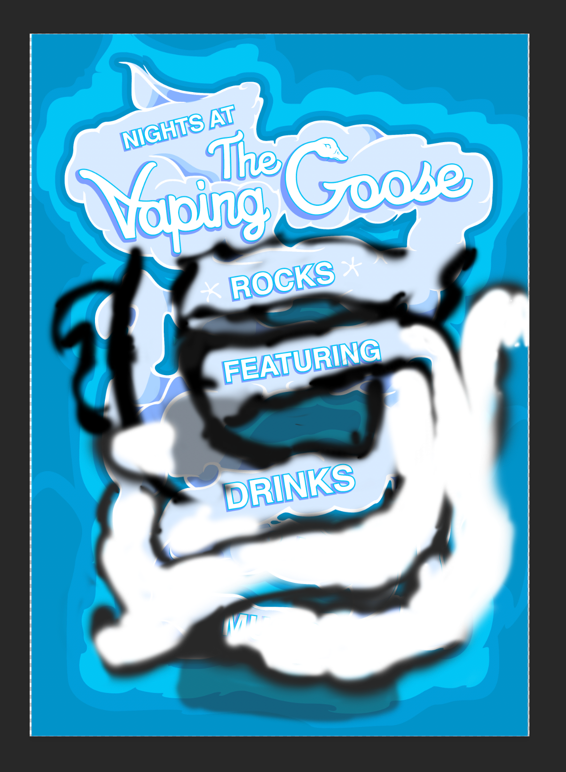
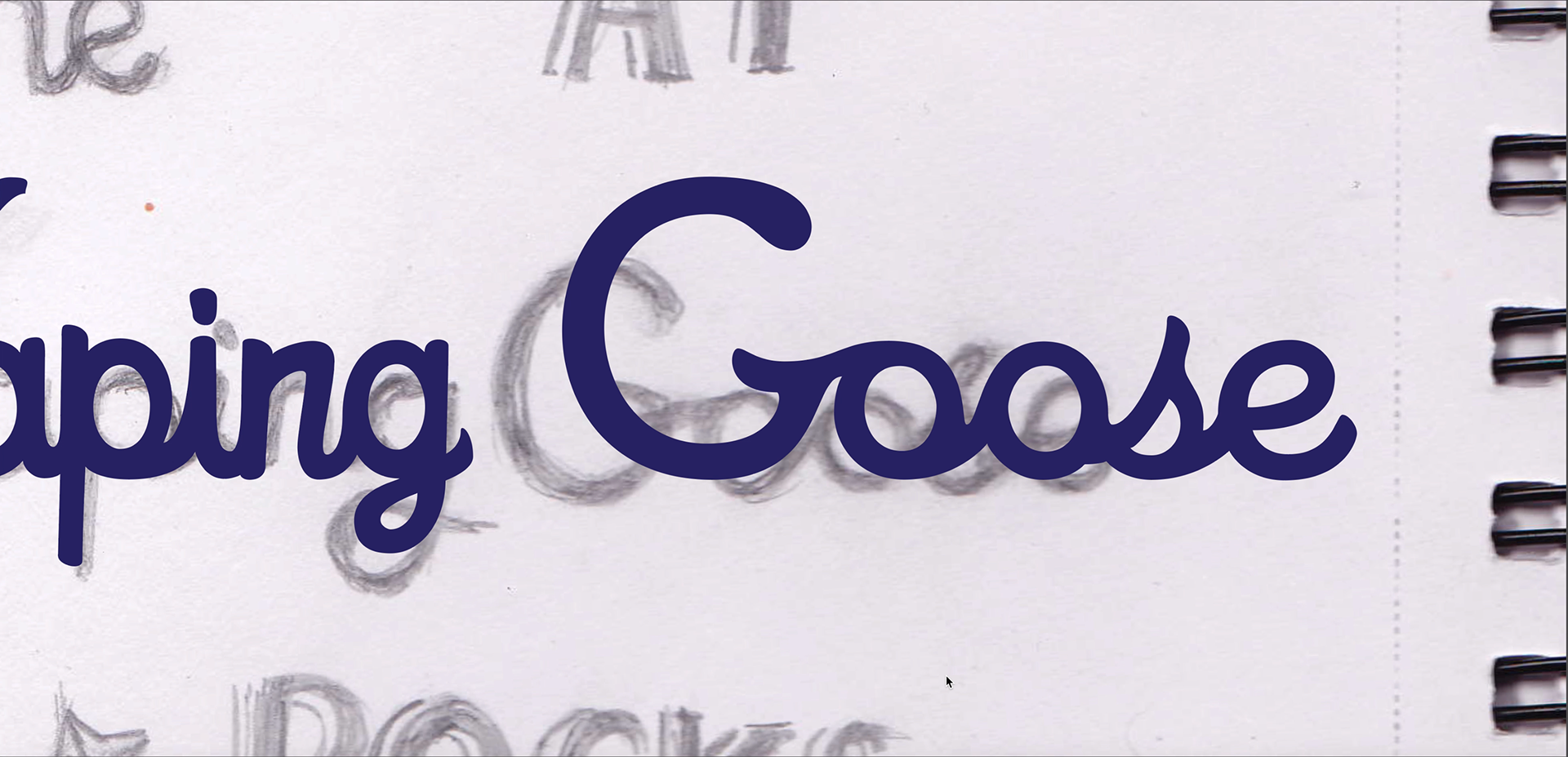
I sketched out the name of the venue using a similar font found on the side of the buildings giving the posters more of a connection to the pub. I then sketched out three centre pieces for the poster that link back to the venue, which resulted in a pint glass, a guitar and a goose illustration.
When it came to developing the posters, the client agreed to keep the poster in an illustrative style. So I started to develop the posters with the intention of creating 3 with different colours, Purple, Blue and Orange, which all could be found at the venue.
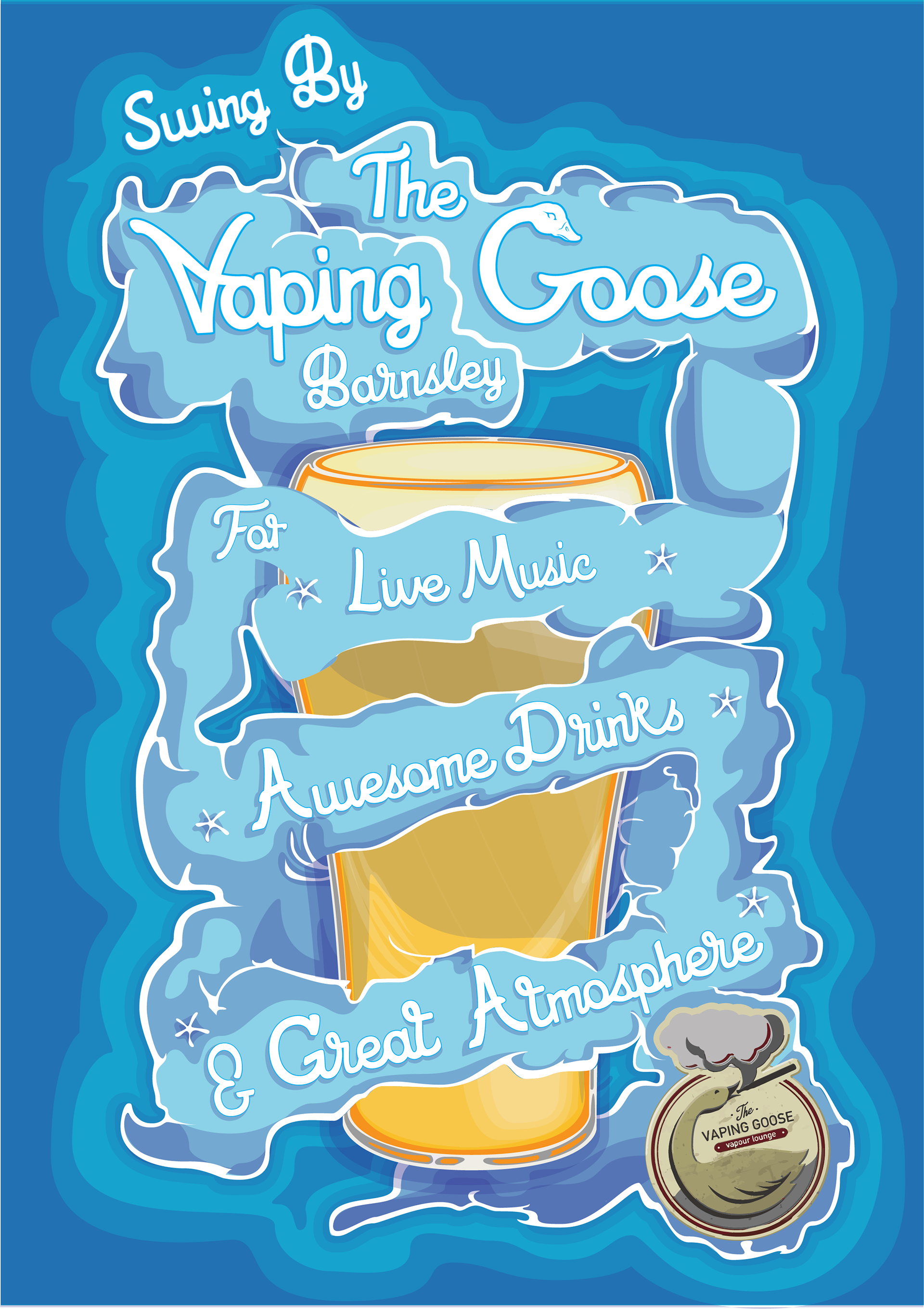
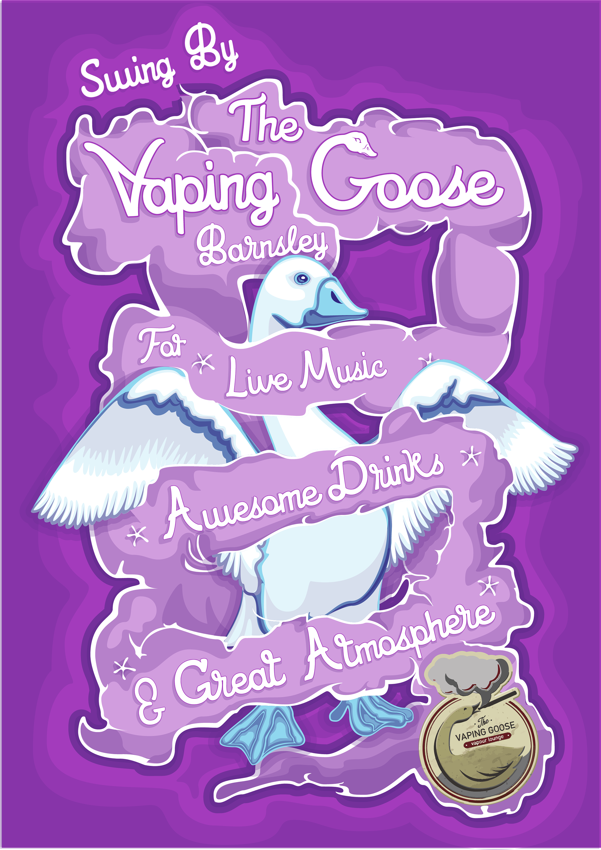
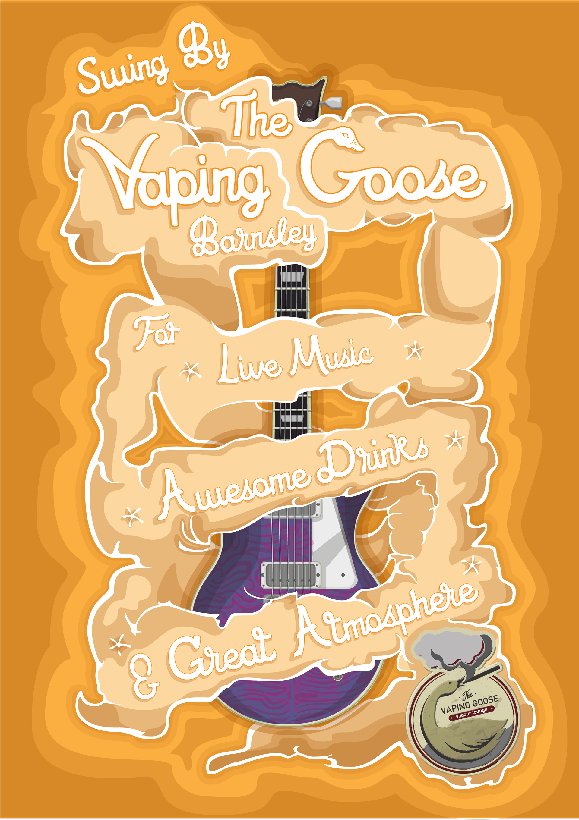
After this was settled I finally began illustrating the centrepieces for the posters that would occupy different versions of the posters. This final part of development also underwent a few changes regarding the colour of the objects.
By swapping the drink's purple darkness to look more orange and yellow and the guitar’s red-orange for more purple and blue. After all the necessary changes had been made the posters were eventually finished and both clients and I were happy with the outcomes.
