Initial Sketches
Final Design
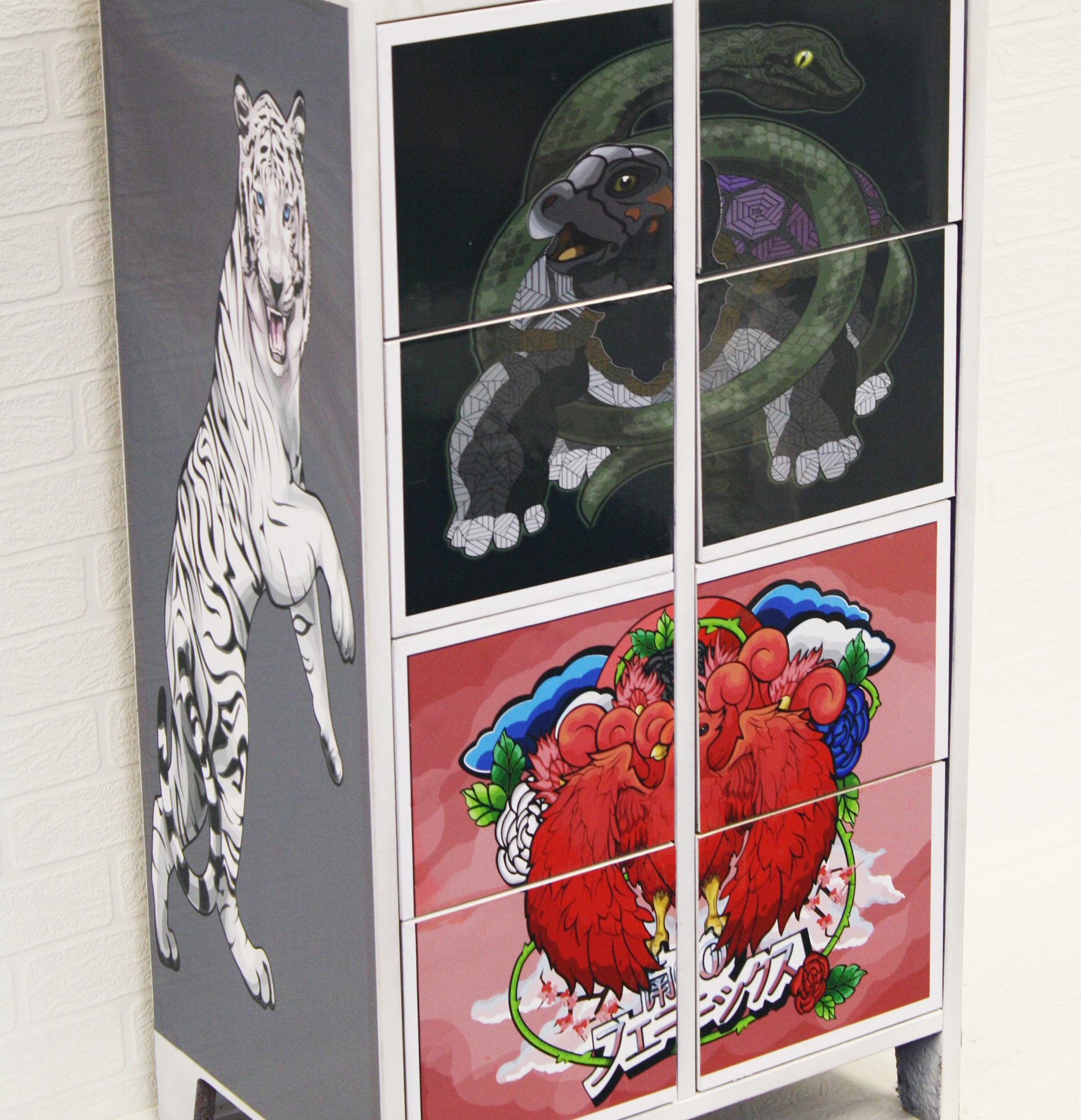
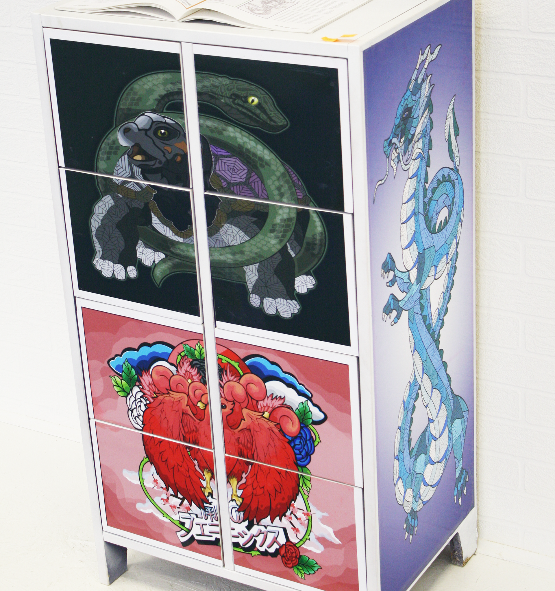
BLACK TURTLE SNAKE
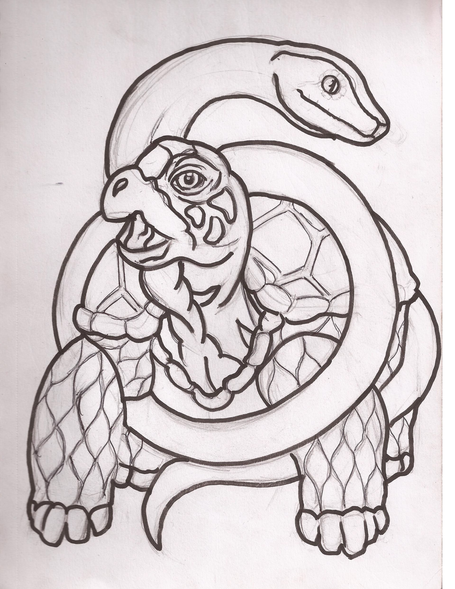
When it came to the turtle-snake design, I used a logical way to separate the styles that connect all the illustrations together. There were multiple details to illustrate for the design so why not have all three styles included by doing the style of snake in the style of Marcelo, the turtles head in the same style of Nickerson and finally the shell and lower body in the style of Preis.
AZURE DRAGON
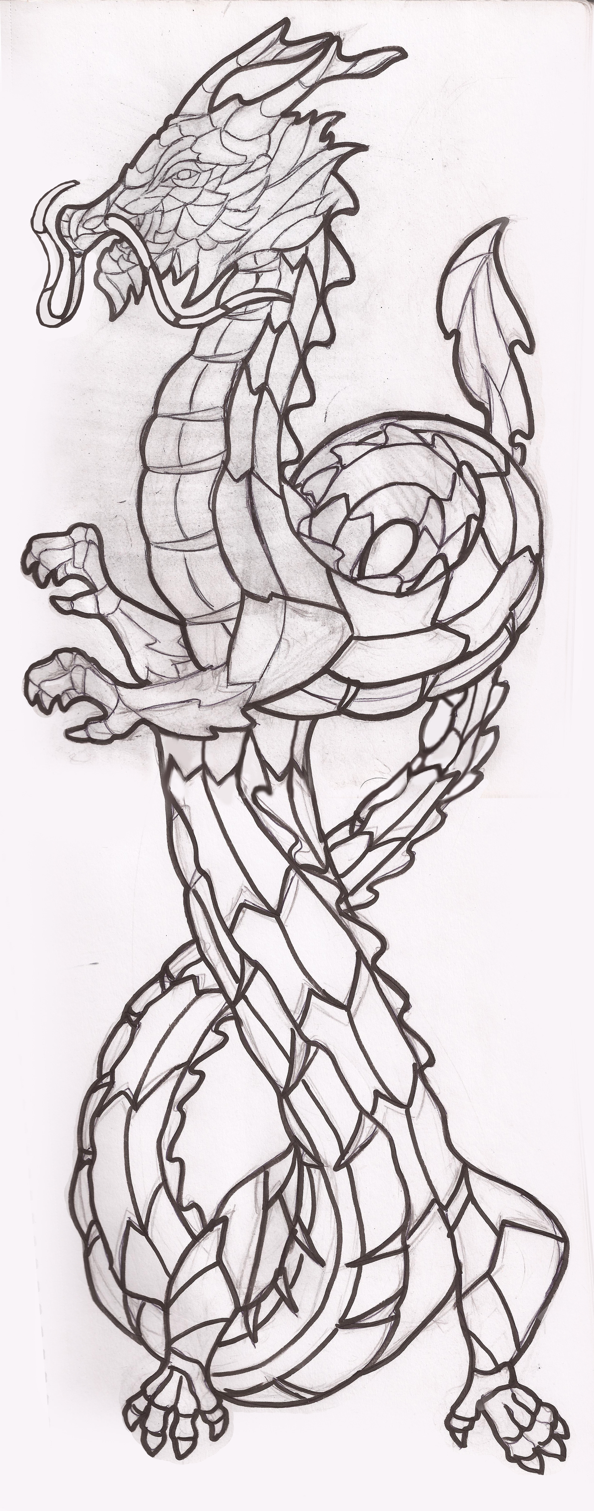
So, when it came down it I thought to use the style of Preis on the dragon as I could play about with geometric patterns and weird shapes and I though the style was best for it. As this was a long illustration it had to be separated into two pages to be able to fit for detail and the flow of the illustration. The addition of extra lines was added during digitising and colouration as there were a lot to include on the illustration.
VERMILLION PHOENIX
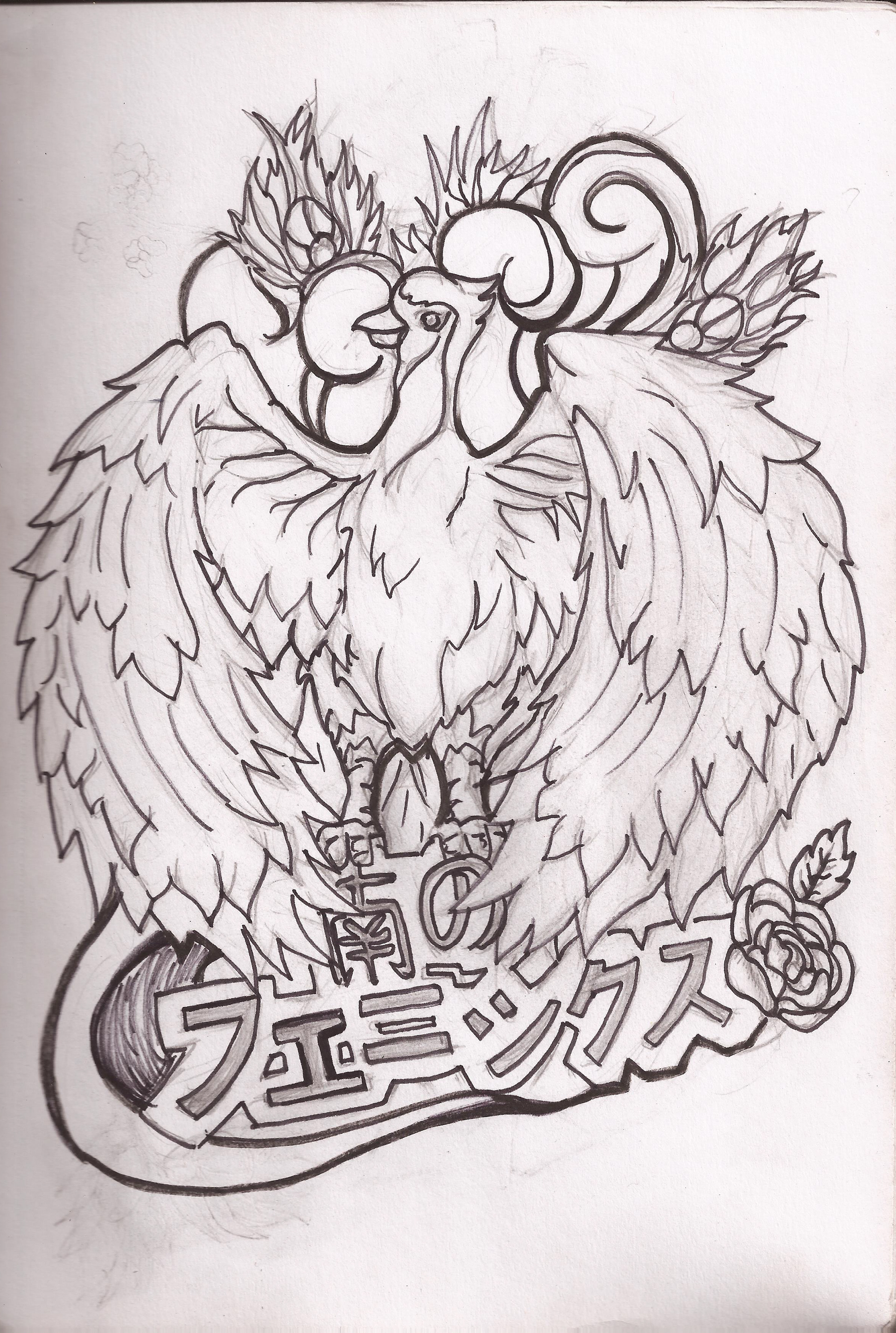
I chose the phoenix to be completed in the style of Nickerson as it looked like a fun and bold style, in my opinion as it just suited the style especially when he includes words in text into his illustrations, I did the same by translating phoenix of the south into Japanese 南のフェニックス. There was a bit of editing and adjusting involved including making the wings look symmetrical as well as just working on the colour and style of the background elements.
WHITE TIGER
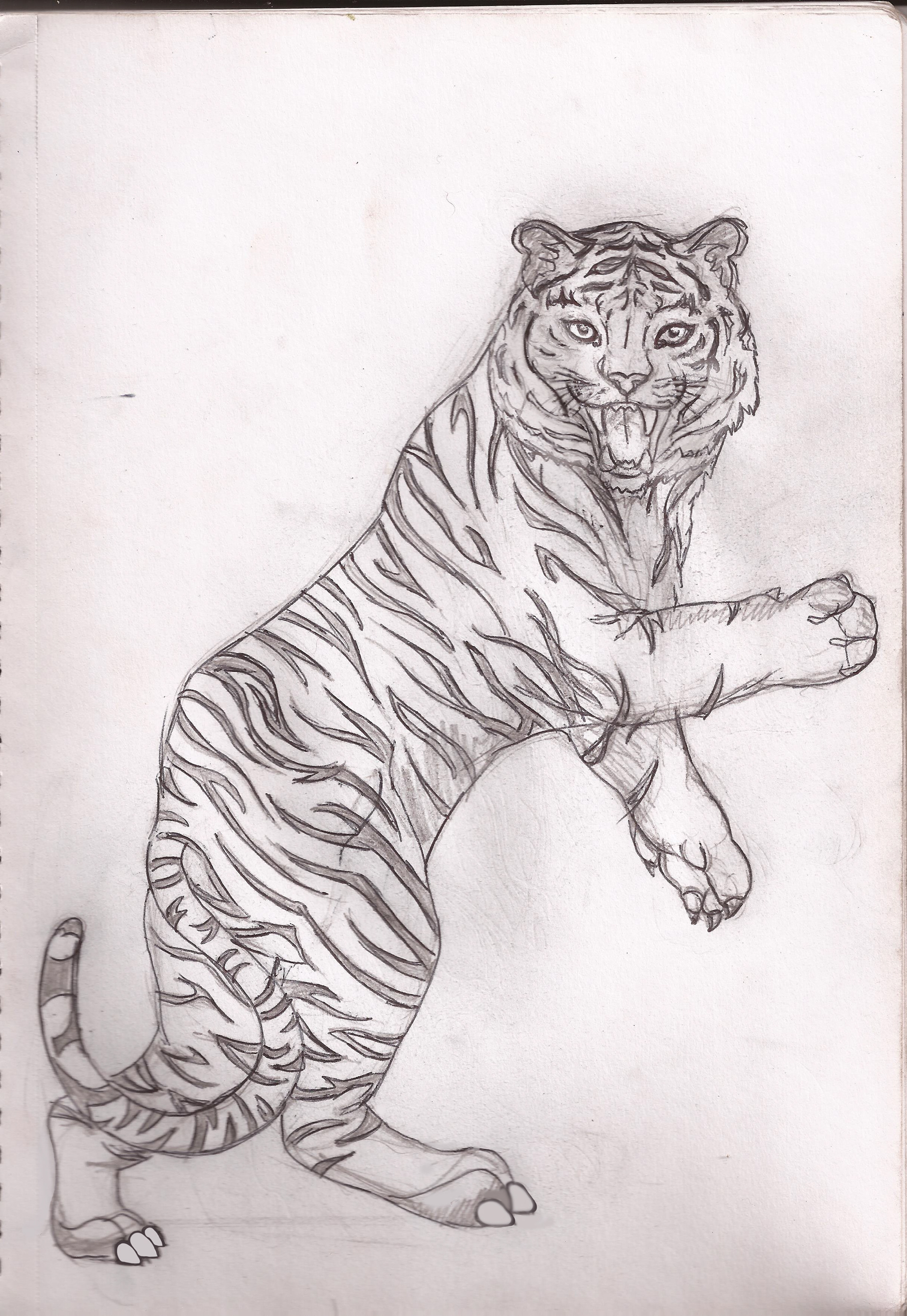
Next, I choose to do the design of the tiger in Marcelo’s style as it would have been a bit tricky to do it in another style, as it made sense to do in a realistic style. While working on the final illustration I did use reference imaging to figure out how the stripes of tiger naturally look on the body.
Design Application
