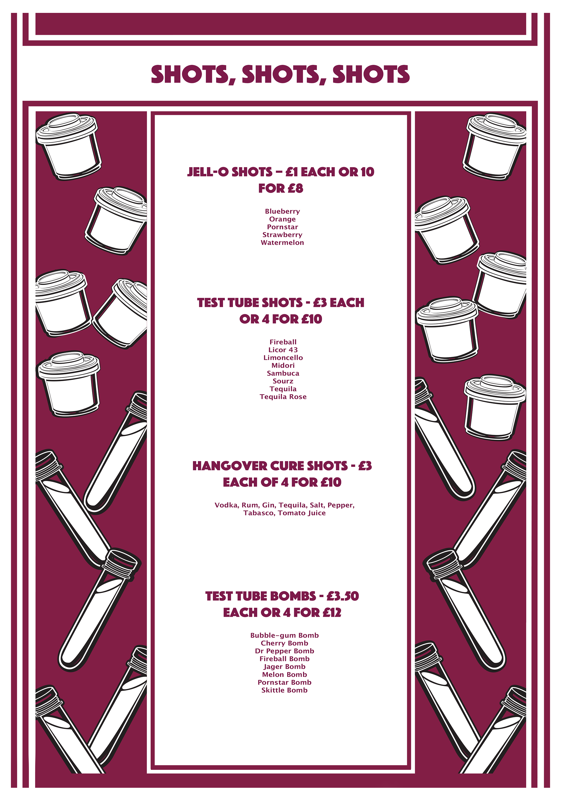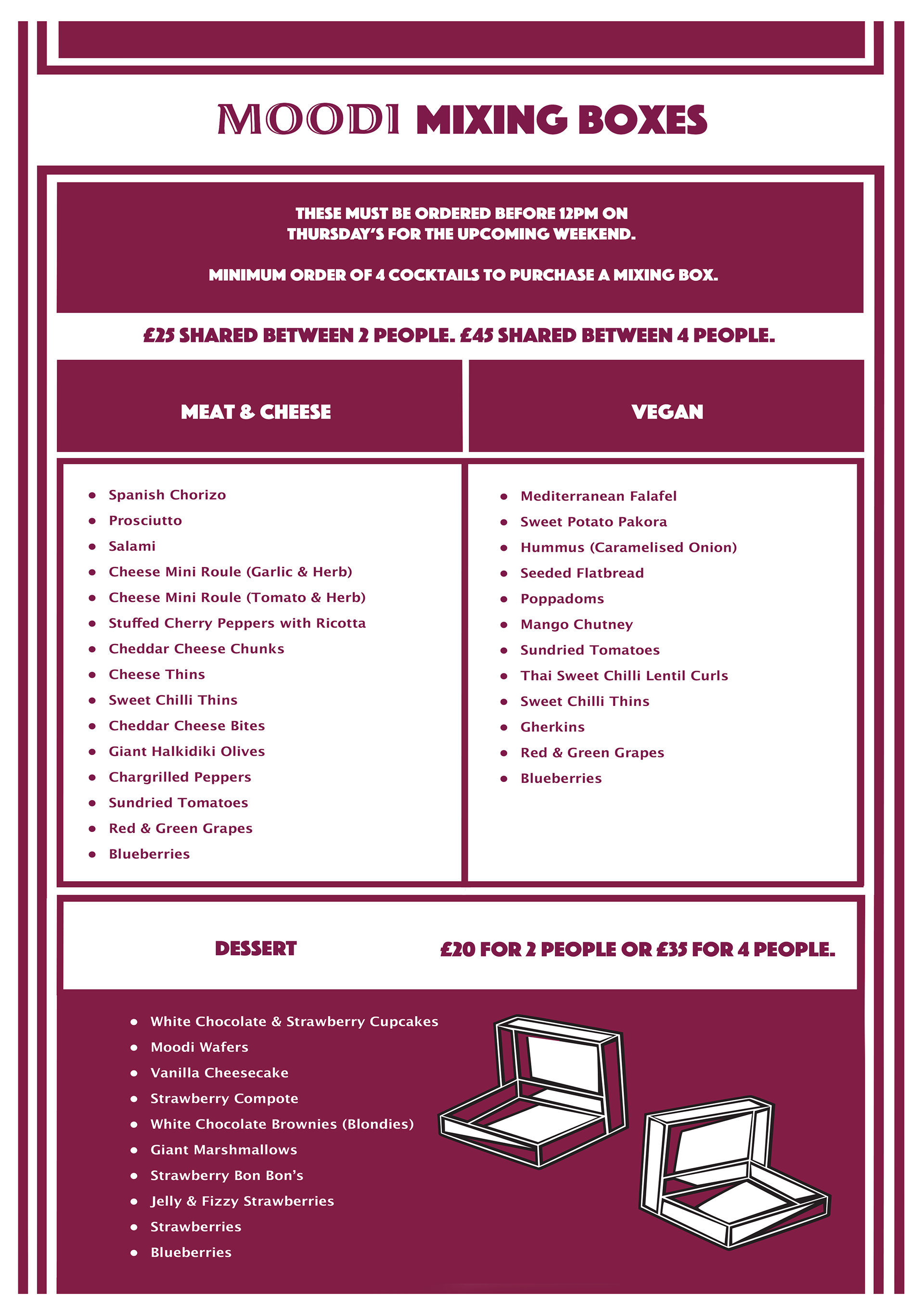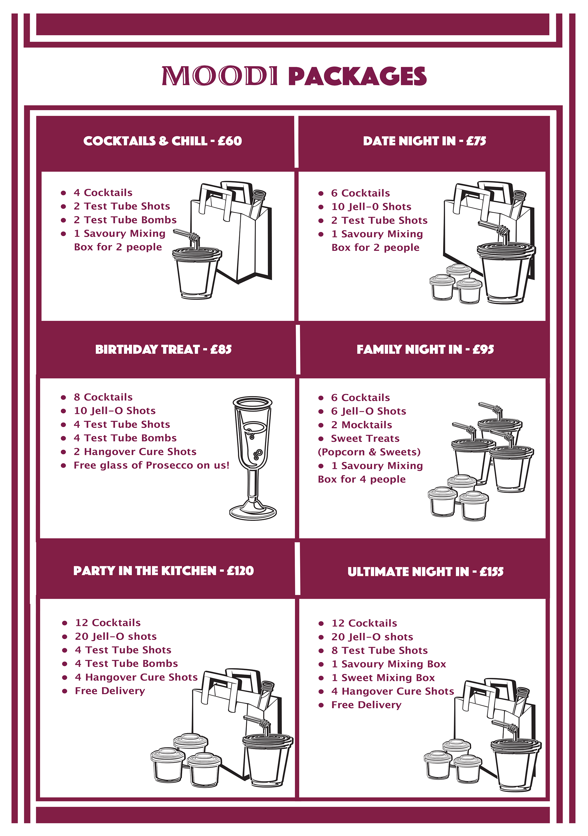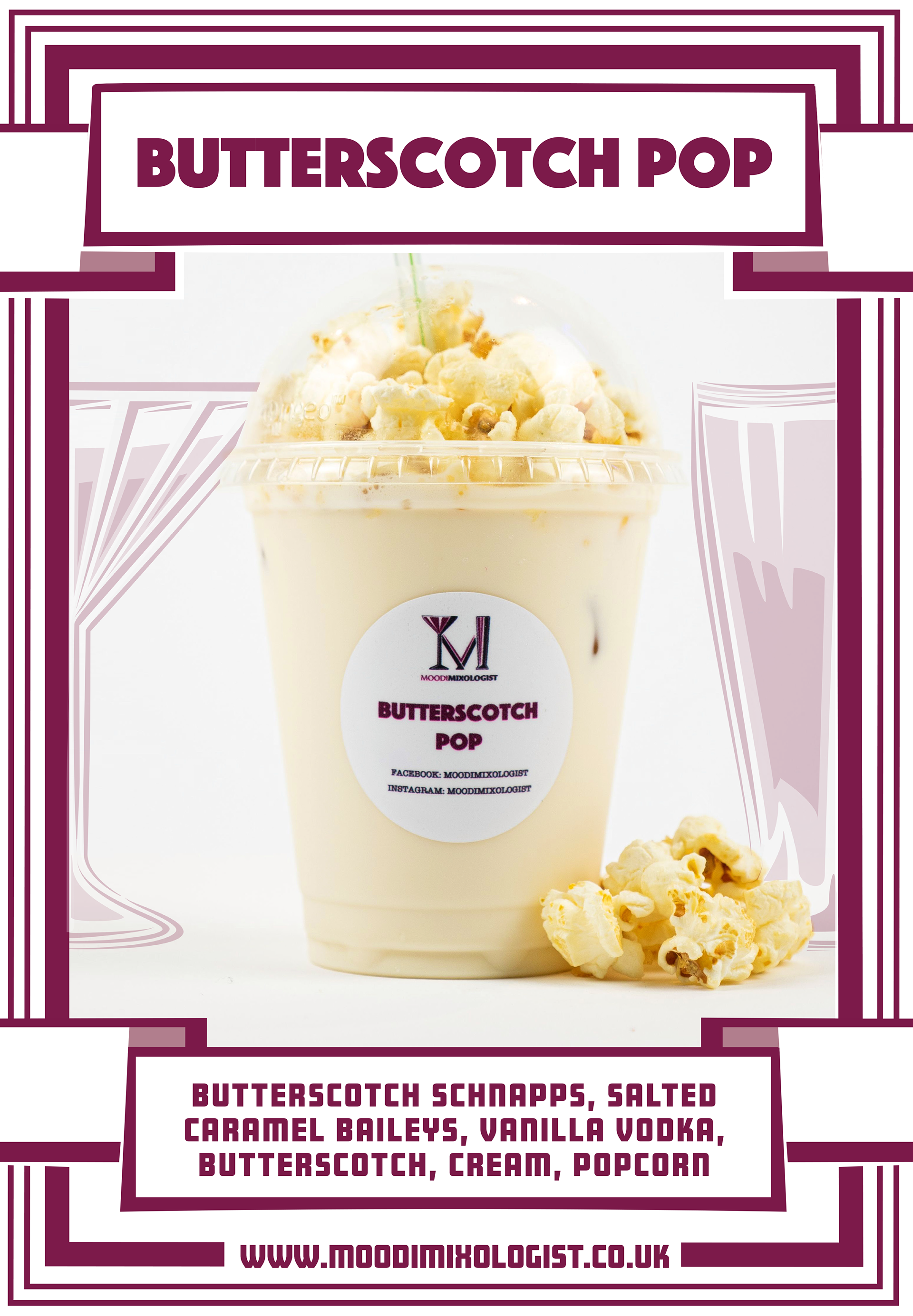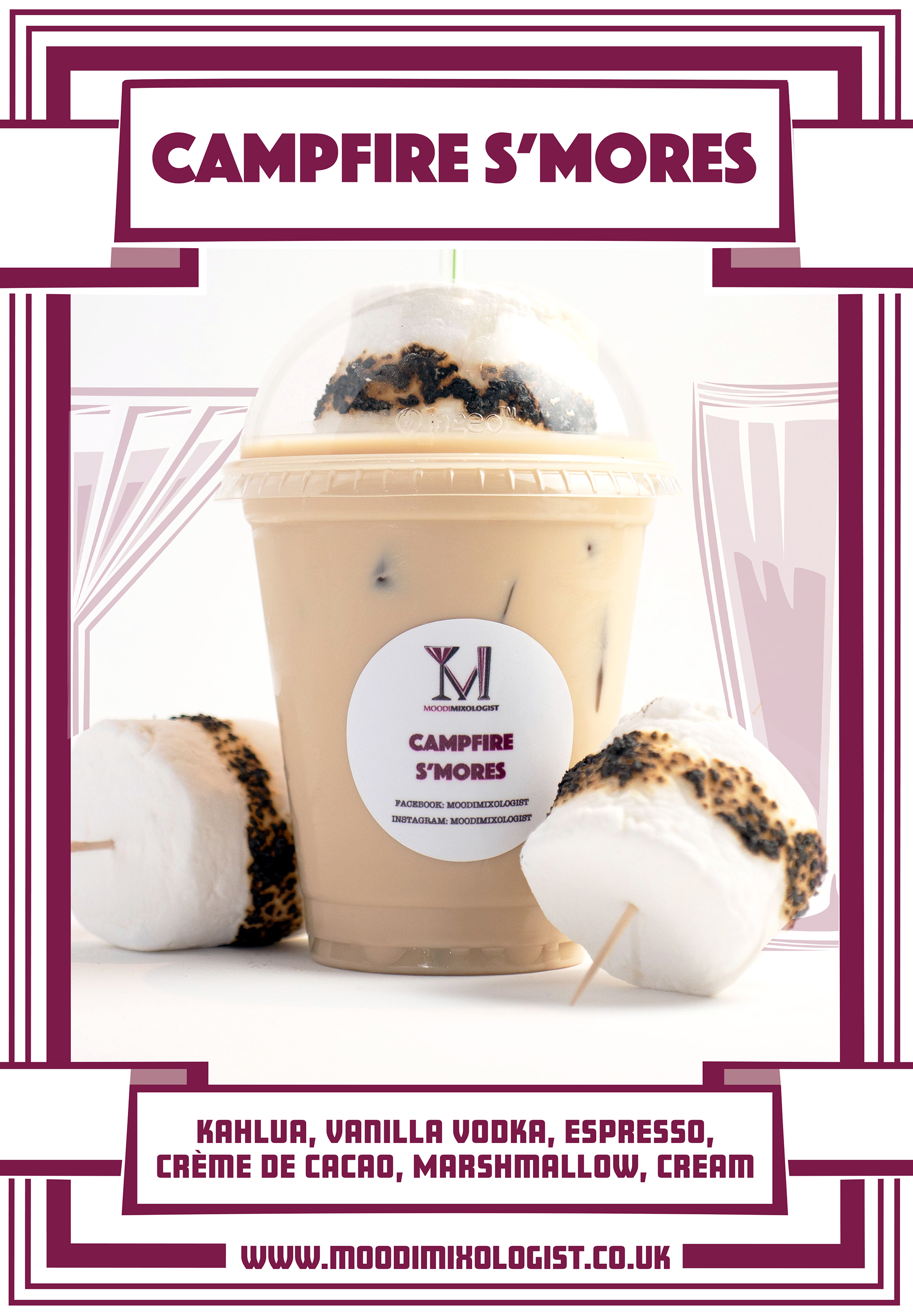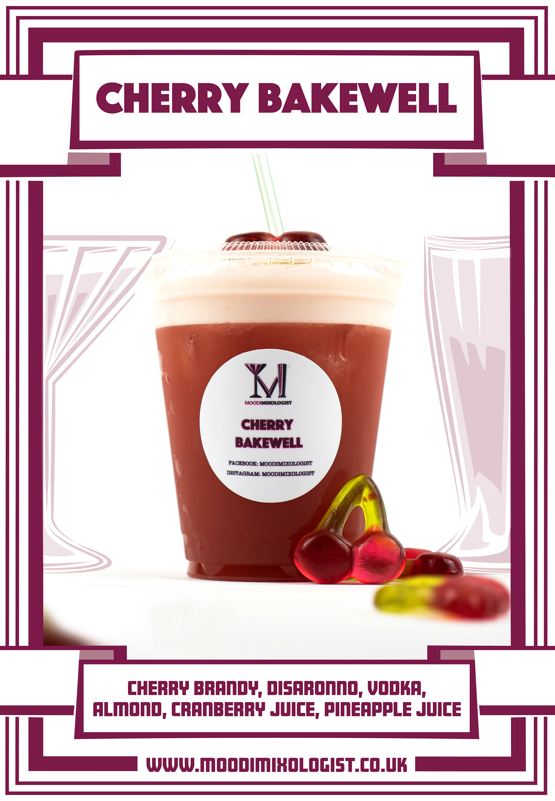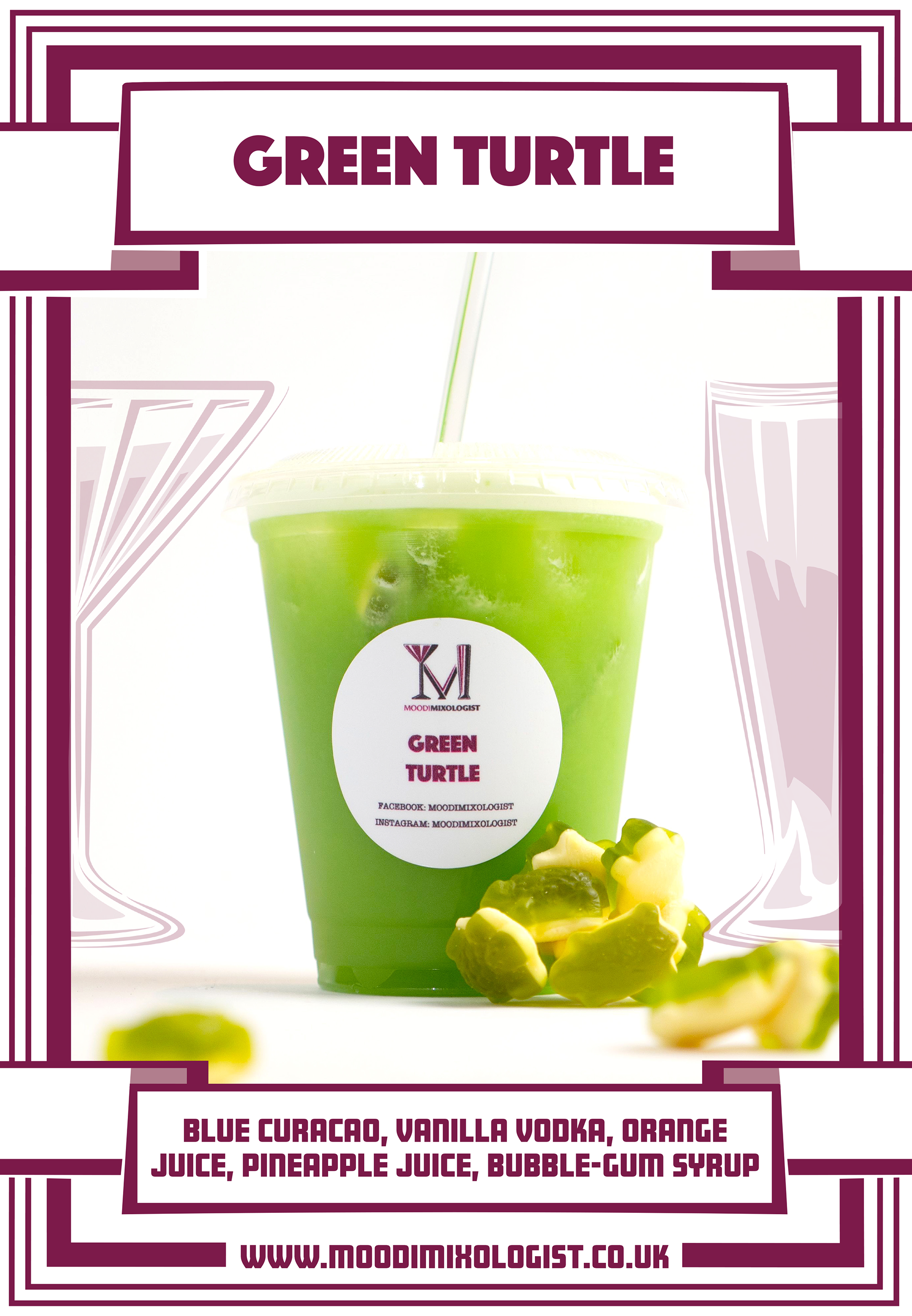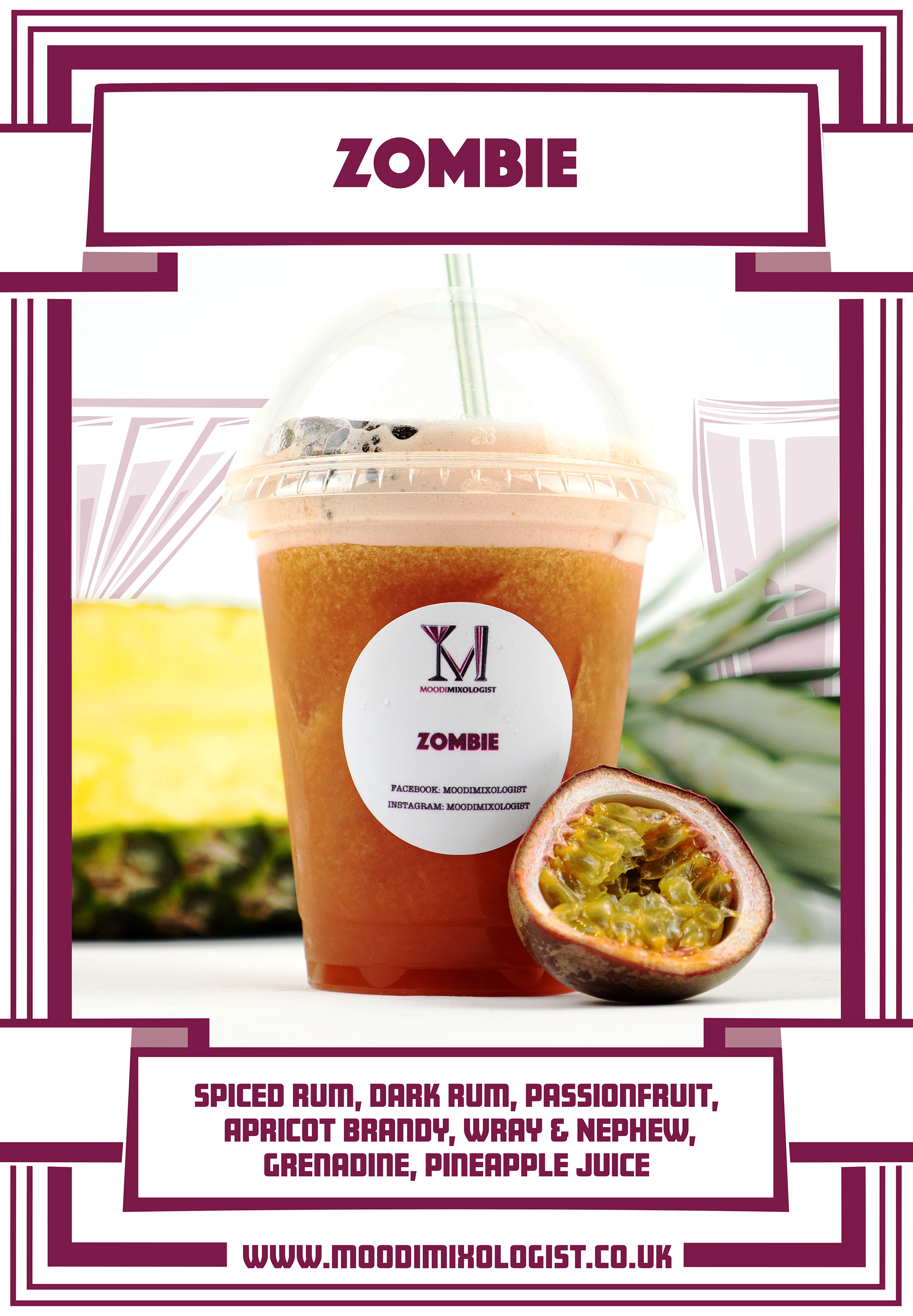
The logo concept and intent are simple. Especially when it came to choosing a colour for the brand, this was one of Grace's immediate intention of using a burgundy to run through the brand. Since Burgundy is a mix of Red and Purple, one colour represents Passion and another represents Luxury.
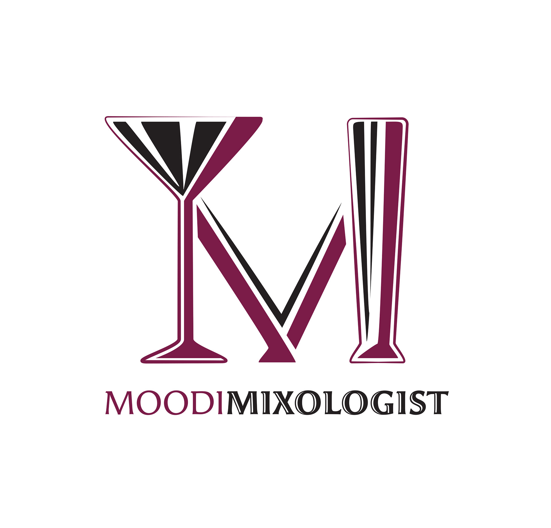
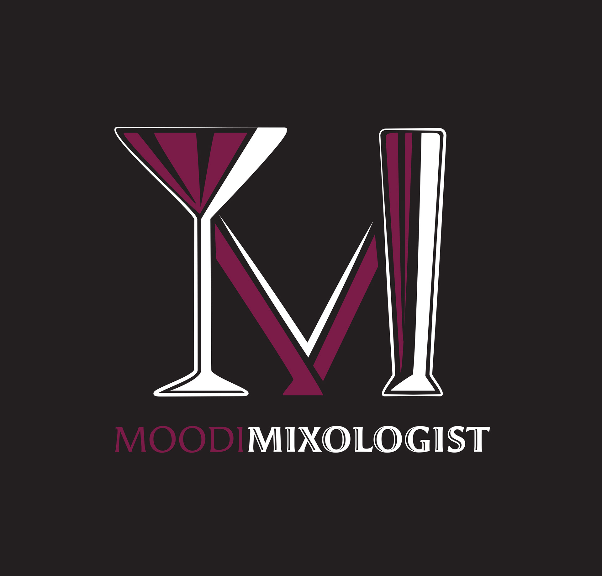
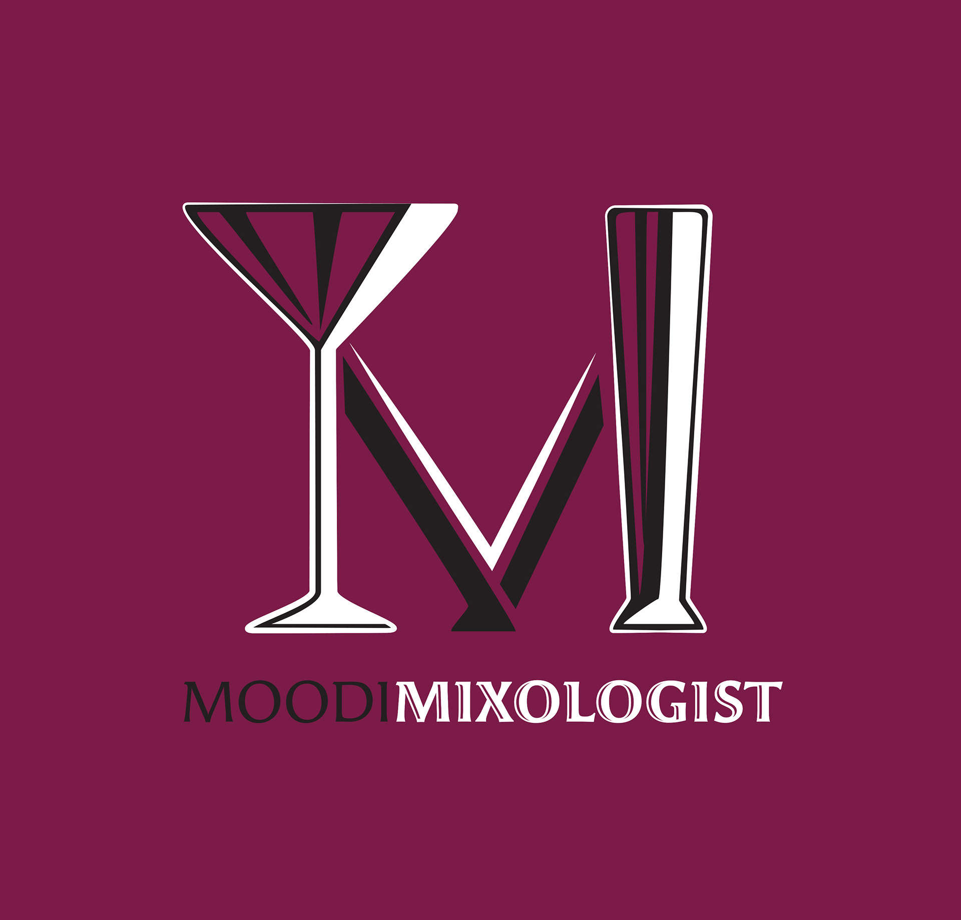
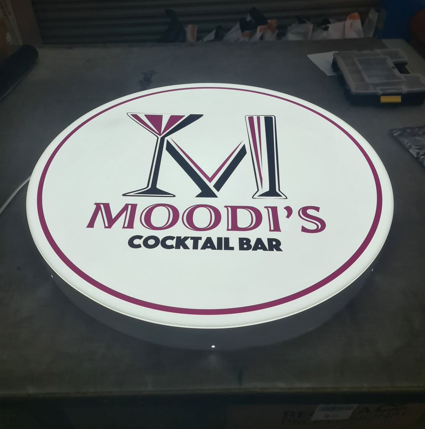
When it came to the Logo for Moodi's it was to focus on an "M" made up of two kinds of Cocktail Glasses as the stems and just a stylised V shape between the two; (This would play into some interesting visuals later down the line).
The tricky bit was finding the appropriate fonts to be used throughout Moodi's Branding. After much deliberation between myself and Grace settled on two fonts; Angie Pro and Angie Open Pro as we thought it was a great idea to use two different fonts in the logo to make it look more distinguishing.
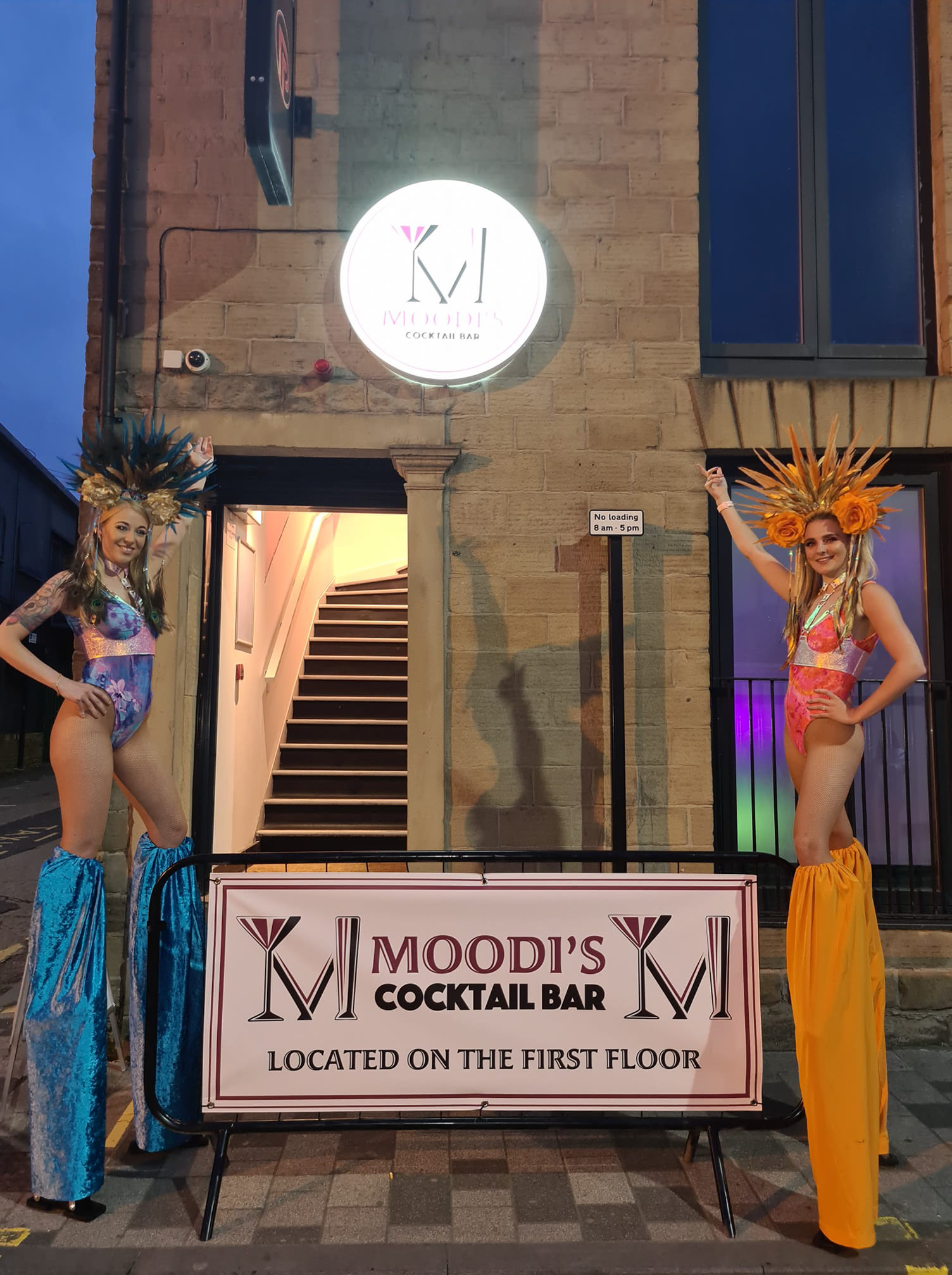
So here are a few examples of the finished logo and other variations we played about when we were finishing the logo development.

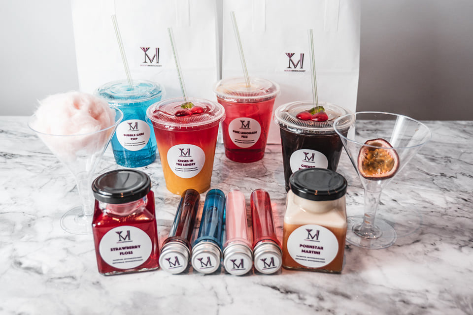


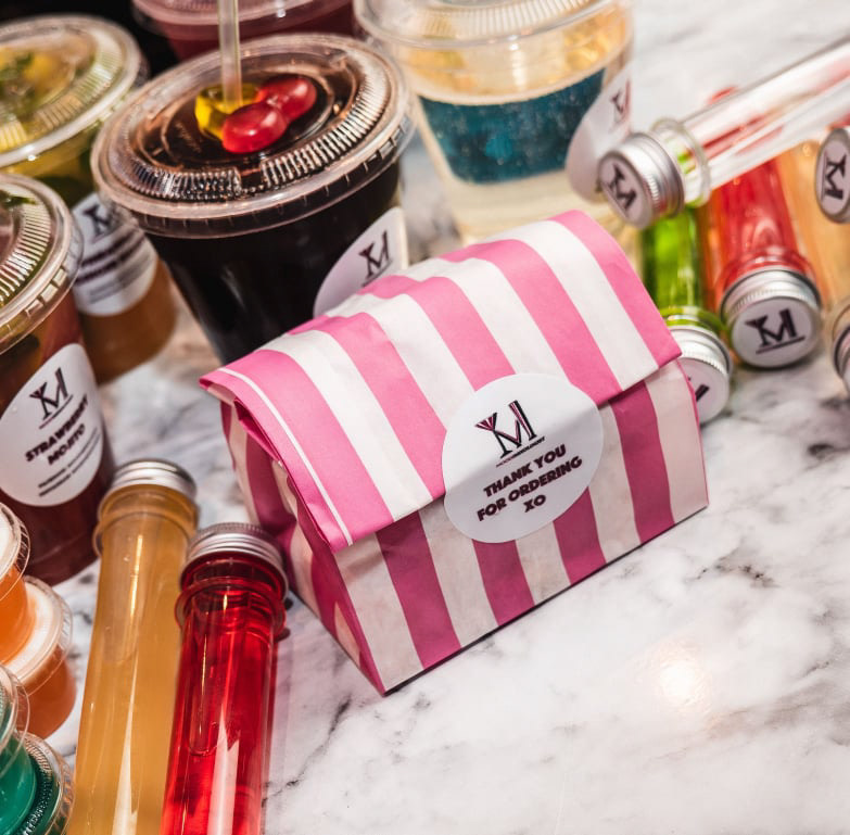
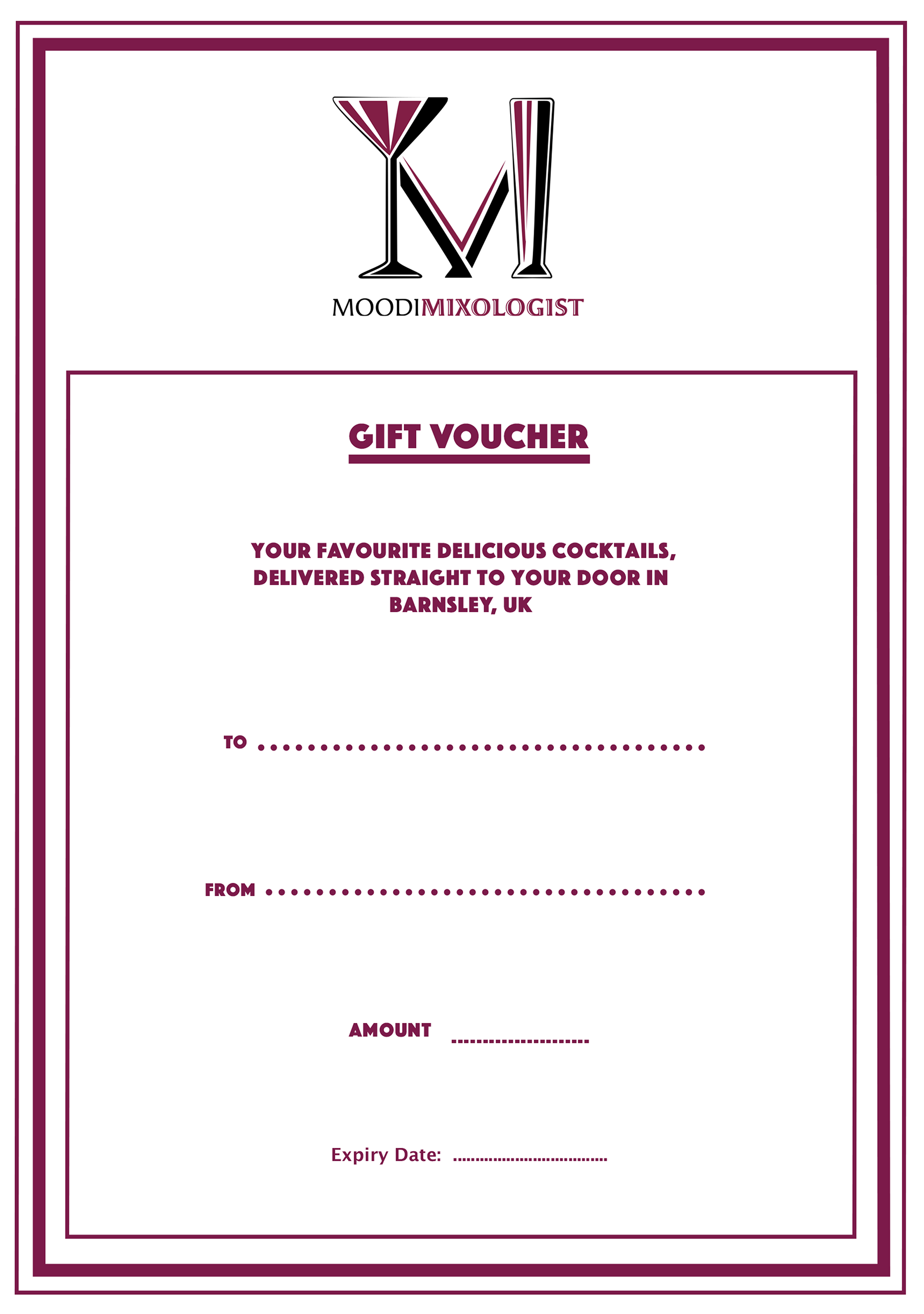
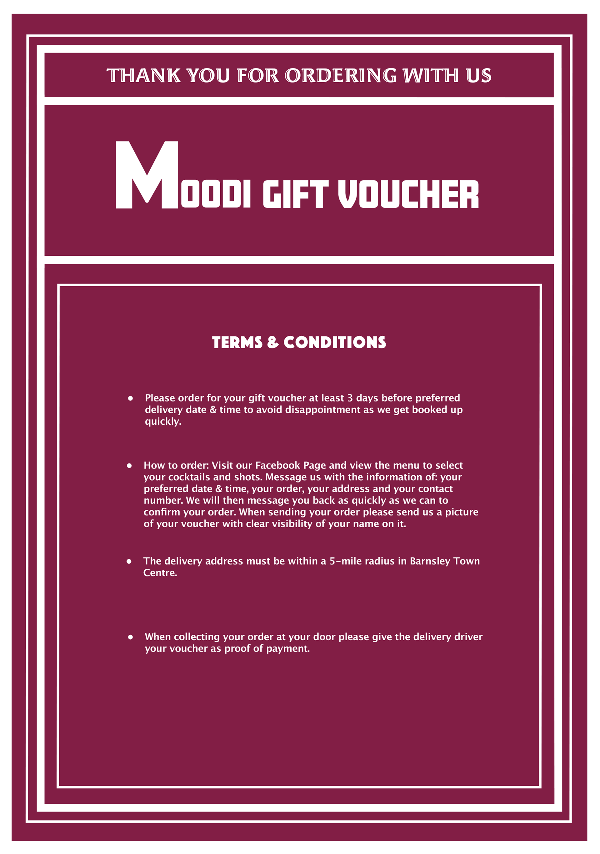
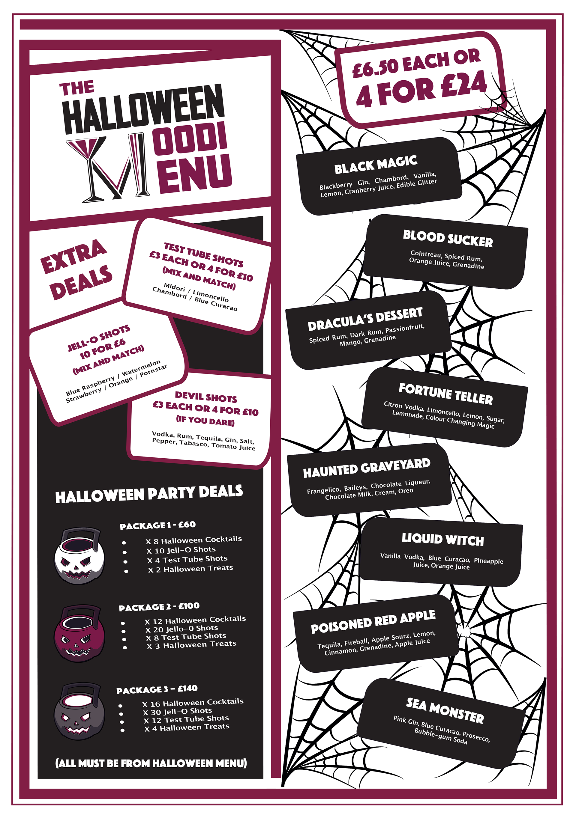
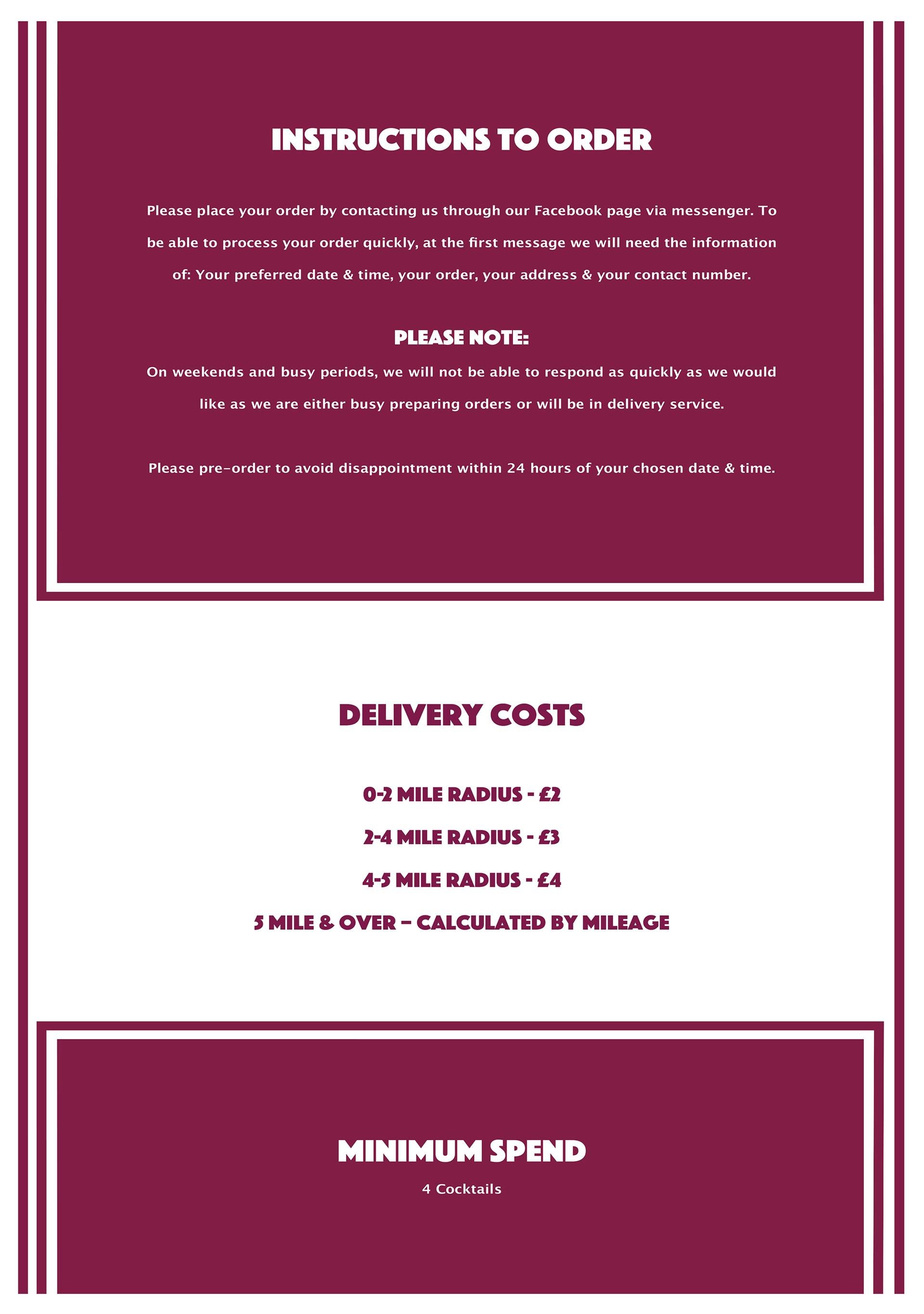
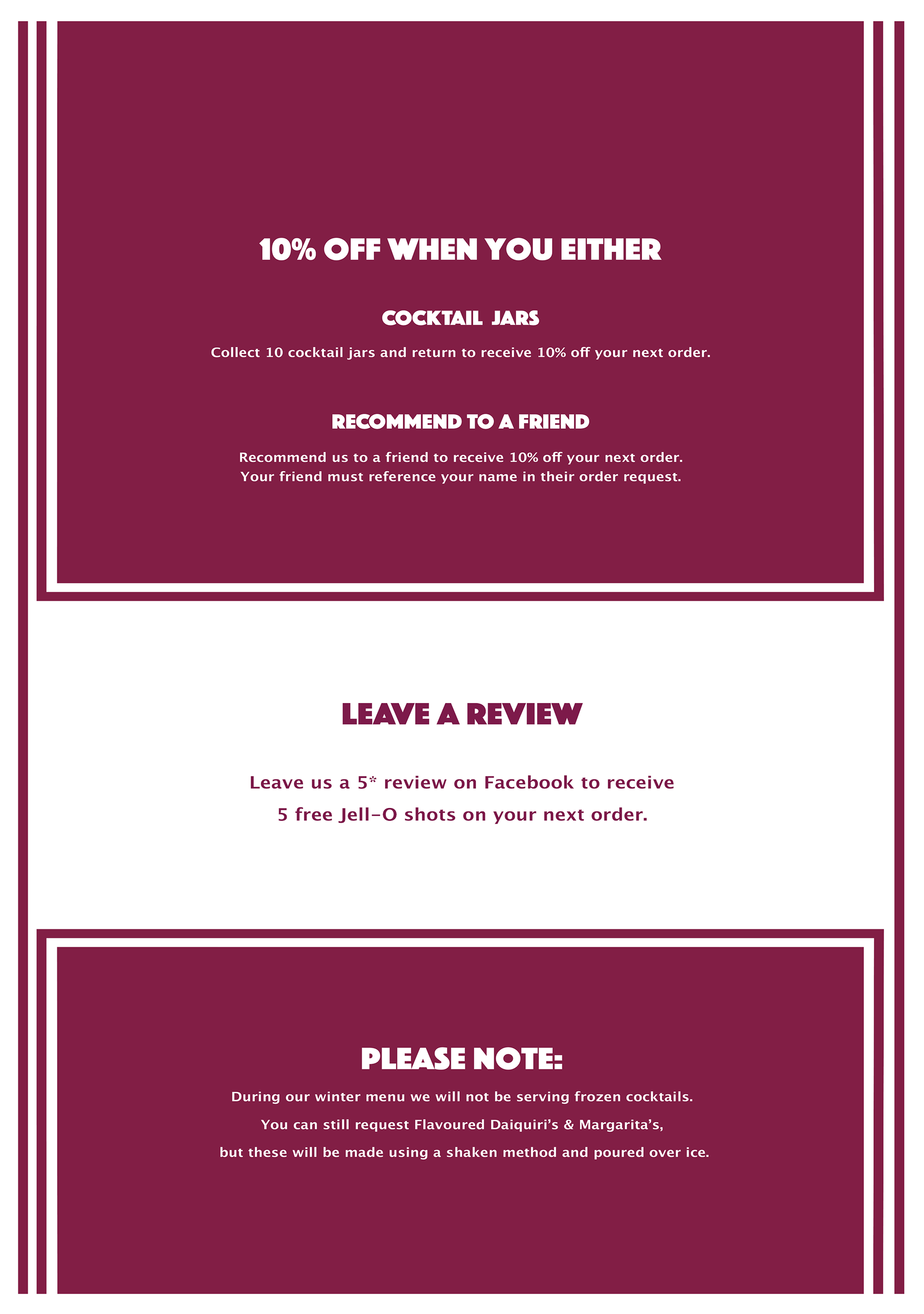
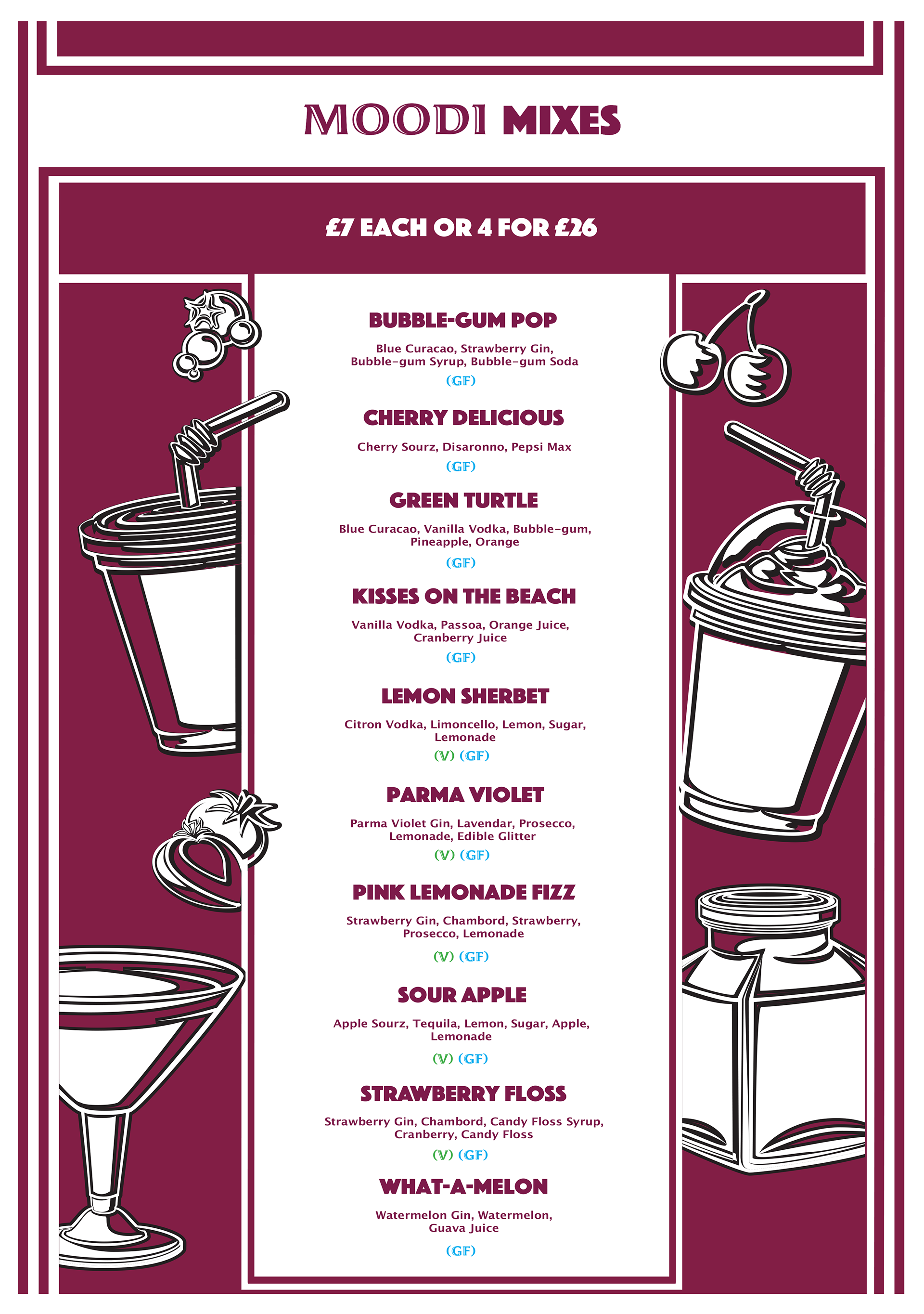
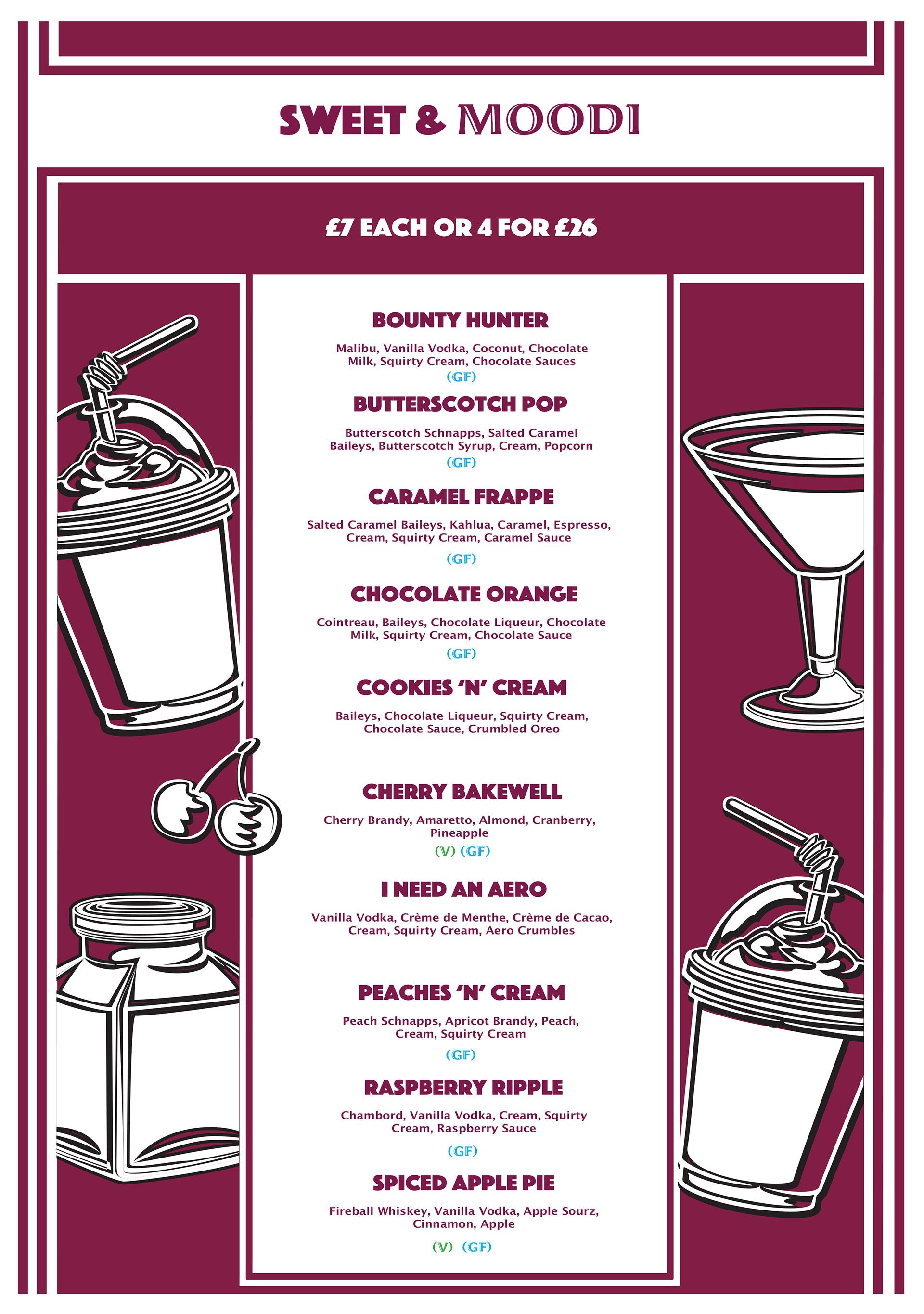
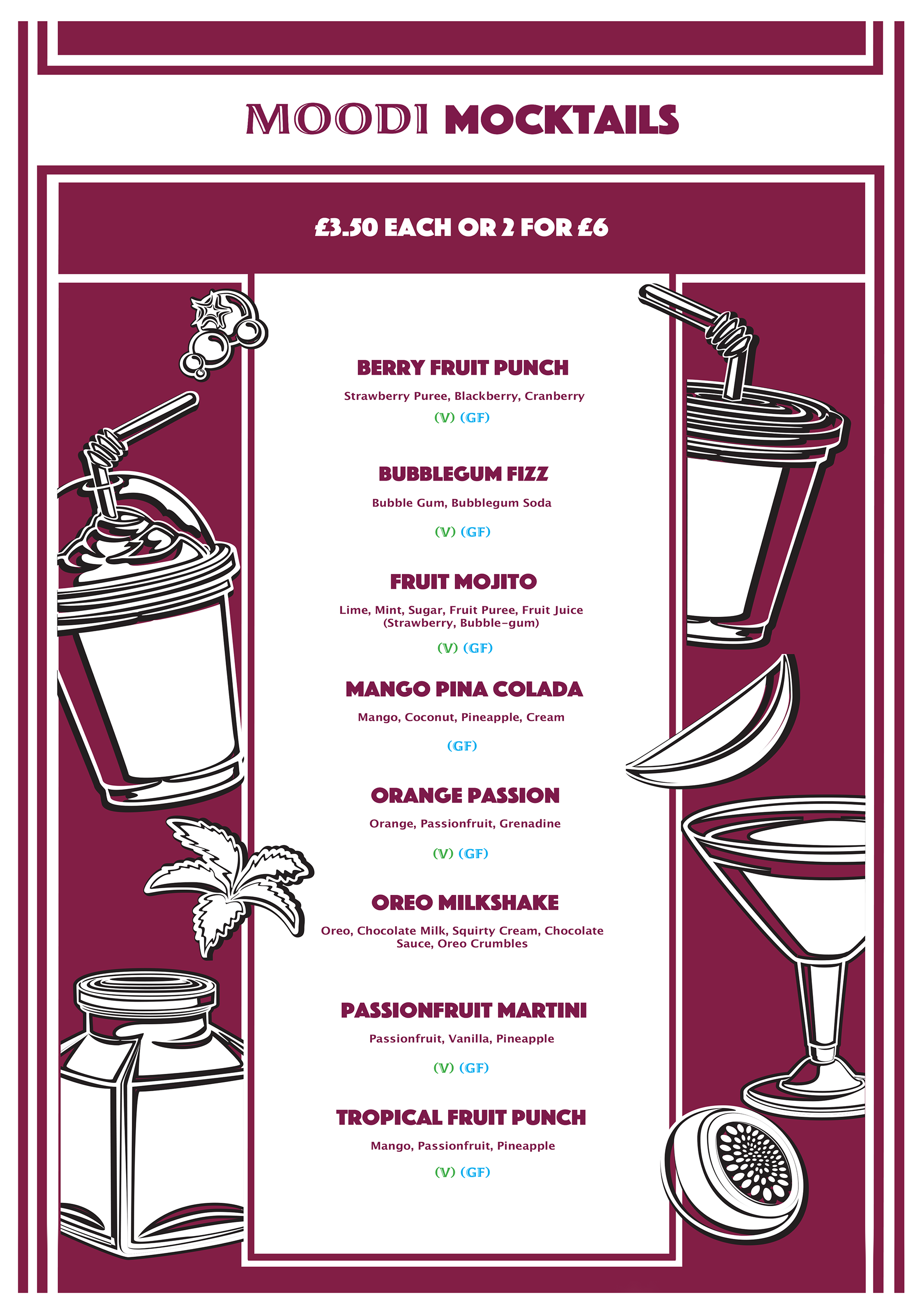
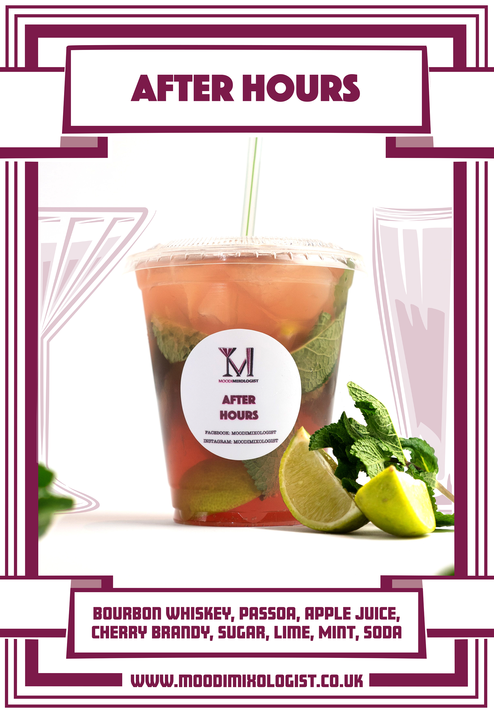
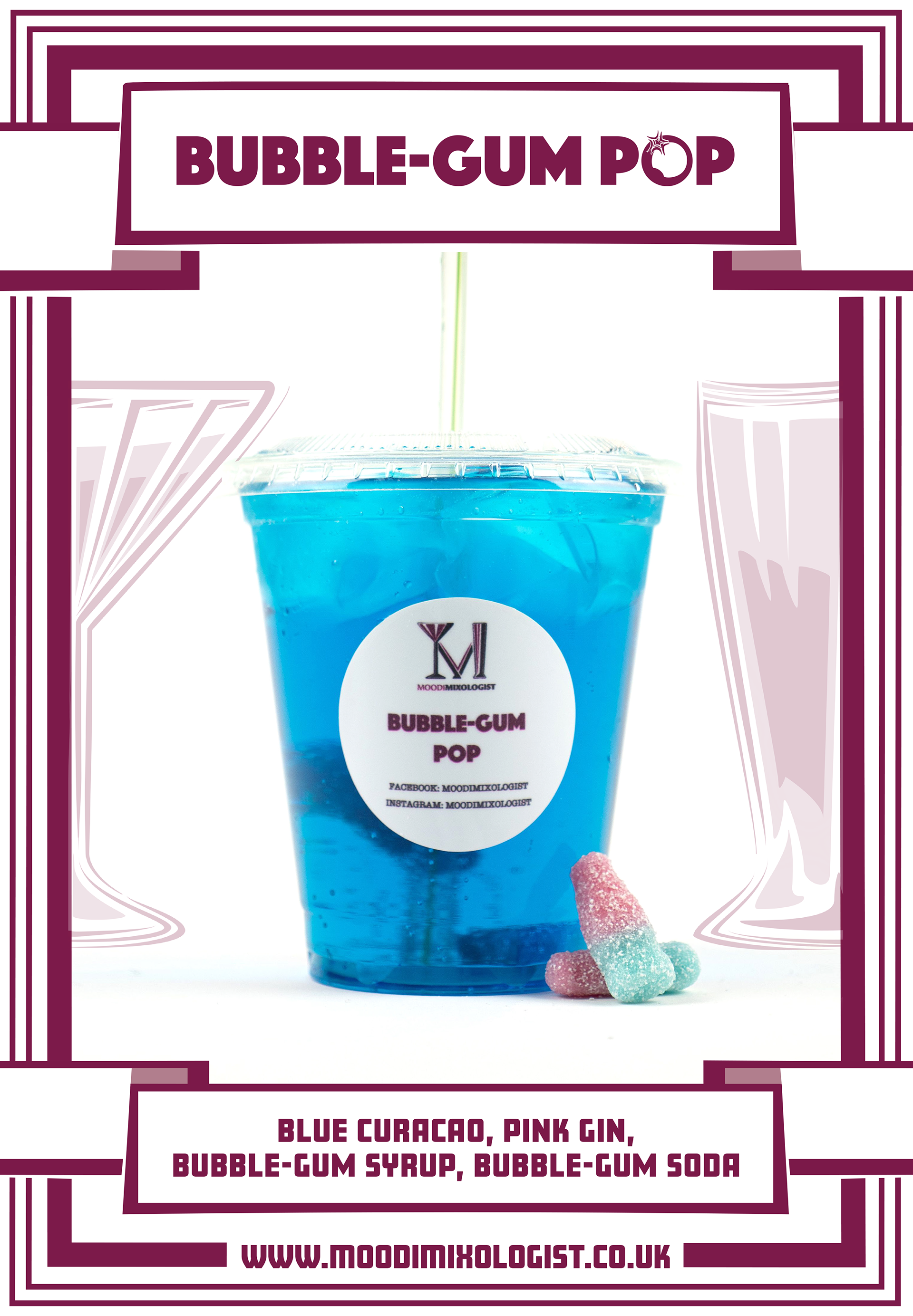
Soon after creating the logo, we quickly cracked on to developing the rest of the brand package such as stickers for the individual cocktails, Vouchers and the first-ever takeaway menus for the business.
This also includes adding additional fonts to the overall branding package of using "Amboy" for Menu titles as it felt it was a great choice that fits in with the style. Next, we looked at using "Phosphate Solid" for the individual Cocktail names and other supporting subheadings as it's such a strong-looking font that fits the brand so well that it is now used on Moodi's Cocktail Bar Logo. Finally, we have "Lucida Grande" Which is used as the basic body text, which is nice simple and fits in with the overall brand.
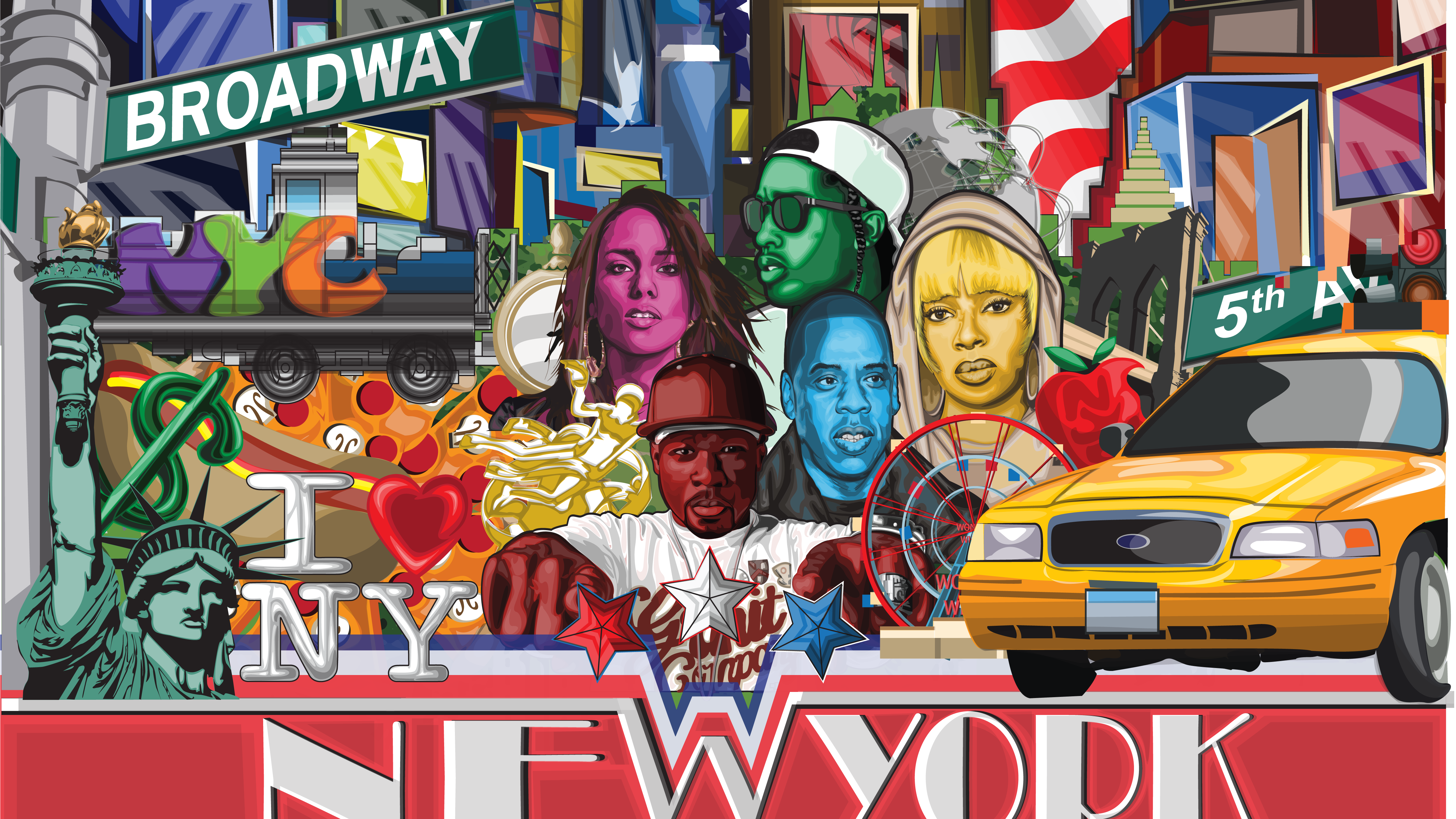
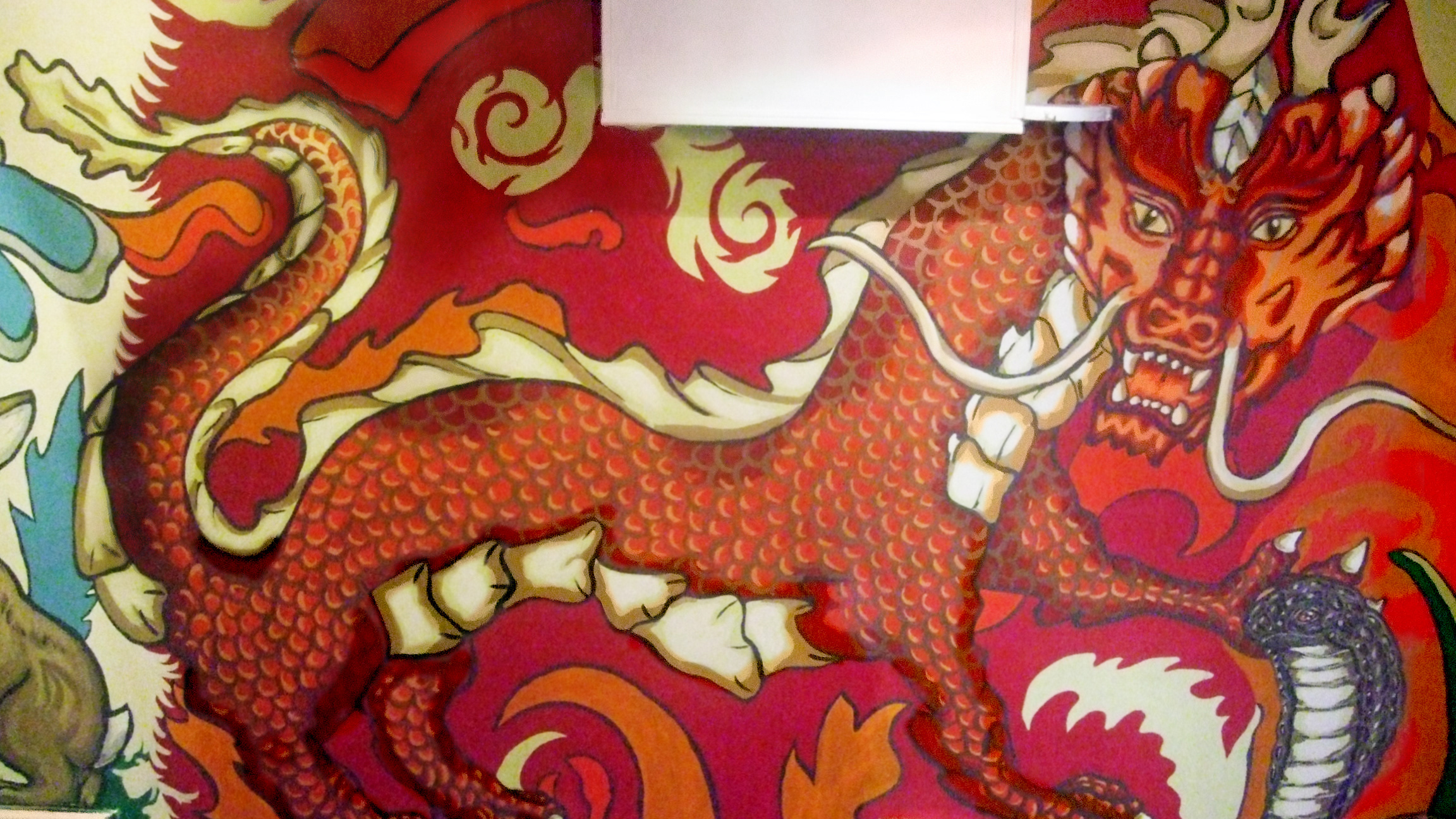
These brand guidelines have remained a constant throughout Moodi's time of being open, even though each menu has a different aesthetic look and theme they all maintain the same Brand Guidelines, this includes the reinvention of the cocktail Bars renovation period.
